【Vue】20.vue项目中引入echarts图表遇到的问题
最近做一个公众号有需求是要添加一个图表,自己调查了一下,决定使用ECharts,在vue项目中引入ECharts,由于第一次做图表,还要跟UI设计图保持一致,也是遇到了好多样式问题,在这里做一下总结。
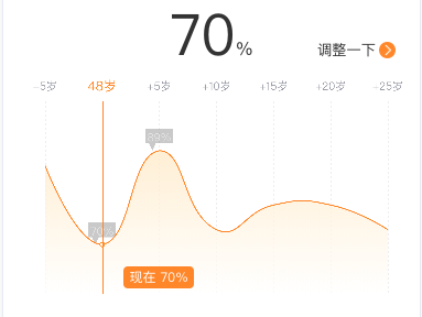
效果图如下:
ECharts官方Docs
ECharts官方Example
ECharts附录一按需引入ECharts图表和组件
一.安装插件
npm install echarts --save
二.在当前页面中按需引入模块
const echarts = require('echarts/lib/echarts');// require('echarts/lib/chart/bar');require('echarts/lib/chart/line');require('echarts/lib/component/tooltip');require('echarts/lib/component/markPoint');require('echarts/lib/component/title');require('echarts/lib/component/axisPointer');
三.在mounted()方法里面加载该折线图
mounted(){this.drawLine();}methods: {drawLine() {const that = this;this.myChat = echarts.init(document.getElementById('myChat'));this.myChat.setOption({tooltip: {show: true,trigger: 'axis',axisPointer: {type: 'line',axis: 'auto',lineStyle: {color: '#F78600',z: 0,symbolSize: 2,},label: {show: true,color: '#F78600',backgroundColor: '#FFFFFF',formatter() {return '';},},},borderColor: '#FFFFFF',formatter(params) {return `<div style="z-index: 10; height: 10px; line-height: 10px; text-align: center; font-size: 12px">${params[0].seriesName} ${params[0].value}%<div/>`;},backgroundColor: '#F78600',showContent: true,},legend: {data: ['平均温度'],},grid: {top: 35,x2: 30,y2: 10,},calculable: true, // 提示框消失xAxis: {position: 'top',type: 'category',data: ['-5岁', `${that.info.age}岁`, '+5岁', '+10岁', '+15岁', '+20岁', '+25岁'],axisPointer: {type: 'line',snap: false,label: {color: '#F78600',backgroundColor: '#FFFFFF',shadowColor: '#FFFFFF',formatter(params) {return `${params.value}`;},},lineStyle: {type: 'solid',},triggerTooltip: true,},backgroundColor: '#F78600',boundaryGap: false,gridIndex: 0,// 坐标轴刻度标签的相关设置axisLabel: {color: '#9EA0AA',fontSize: 10,interval: 'auto',},// 坐标轴轴线相关设置axisLine: {show: false,},// 刻度线axisTick: {show: false,alignWithLabel: true,},// 网格线splitLine: {show: true,lineStyle: {// width: 1,type: 'dotted',color: '#EEEEEE',},},},yAxis: [{show: false, // 是否显示Y轴scale: true, // 只在数值轴中有效// position: 'right', // 坐标轴显示的位置type: 'value',name: '温度',min: that.dataArrMin - 10,max: that.dataArrMax + 10,interval: 1,axisLabel: {formatter: '{value}%',},},],series: [{name: '现在',type: 'line',stack: '总量',smooth: true, // 曲线平滑true// symbol: 'circle',symbolSize: 4,showSymbol: false,hoverAnimation: false,z: 20,markPoint: {z: 1000,symbol: 'path://m 0,0 h 48 v 20 h -30 l -6,10 l -6,-10 h -6 z',showSymbol: true,itemStyle: {color: '#939393',opacity: 0.5,width: 74,height: 32.4,borderRadius: 50,z: 1000,},symbolSize: [25, 20], // 容器大小symbolOffset: [0, -10], // 位置偏移label: {position: 'insideTop',distance: 4,offset: [0, -2],color: '#ffffff',fontSize: 10,textBorderRadius: 10,formatter(params) {return `${params.value}%`;},},data: [{type: 'max', name: '最大值'},{type: 'min', name: '最小值'},],},itemStyle: {normal: {areaStyle: {z: 10,type: 'default',// 渐变色实现color: new echarts.graphic.LinearGradient(0, 0, 0, 1,// 变化度// 三种由深及浅的颜色[{offset: 0,color: '#FFE8BF',},// {// offset: 0.5,// color: '#FFFFFF',// },{offset: 1,color: '#FFFFFF',}]),},lineStyle: { // 线的颜色width: 1,type: 'solid',color: '#F78600',},label: {show: false,position: 'top',textStyle: {color: '#F78600',},},color: '#FFFFFF',borderColor: '#F78600',borderWidth: 1,},},areaStyle: {},data: that.dataArr,},],});window.addEventListener('resize', this.myChat.resize);this.myChat.dispatchAction({type: 'showTip',seriesIndex: 0,dataIndex: 1,z: 0,});},}
四.图表的一些样式问题
(1)ECharts X轴固定在上方
xAxis: {position: 'top',}
(2)ECharts line动态刷新数据
data: 动态接口数据
(3)ECharts tooltip提示框
tooltip ={ //提示框组件trigger: 'item', //触发类型,'item'数据项图形触发,主要在散点图,饼图等无类目轴的图表中使用。 'axis'坐标轴触发,主要在柱状图,折线图等会使用类目轴的图表中使用。triggerOn:"mousemove", //提示框触发的条件,'mousemove'鼠标移动时触发。'click'鼠标点击时触发。'mousemove|click'同时鼠标移动和点击时触发。'none'不在 'mousemove' 或 'click' 时触发showContent:true, //是否显示提示框浮层alwaysShowContent:true, //是否永远显示提示框内容showDelay:0, //浮层显示的延迟,单位为 mshideDelay:100, //浮层隐藏的延迟,单位为 msenterable:false, //鼠标是否可进入提示框浮层中confine:false, //是否将 tooltip 框限制在图表的区域内transitionDuration:0.4, //提示框浮层的移动动画过渡时间,单位是 s,设置为 0 的时候会紧跟着鼠标移动position:['50%', '50%'], //提示框浮层的位置,默认不设置时位置会跟随鼠标的位置,[10, 10],回掉函数,inside鼠标所在图形的内部中心位置,top、left、bottom、right鼠标所在图形上侧,左侧,下侧,右侧,formatter:"{b0}: {c0}<br />{b1}: {c1}", //提示框浮层内容格式器,支持字符串模板和回调函数两种形式,模板变量有 {a}, {b},{c},{d},{e},分别表示系列名,数据名,数据值等backgroundColor:"transparent", //标题背景色borderColor:"#ccc", //边框颜色borderWidth:0, //边框线宽padding:5, //图例内边距,单位px 5 [5, 10] [5,10,5,10]textStyle:mytextStyle, //文本样式};
(4)ECharts 初始化的时候显示tooltip提示框
window.addEventListener('resize', this.myChat.resize);this.myChat.dispatchAction({type: 'showTip',seriesIndex: 0,dataIndex: 1,z: 0,});
(5)图表高度调整
动态获取的数据,如果数组高度不一样,就会导致图表的高度不一致,怎么调整呢?
//直角坐标系内绘图网格grid : {left : '3%', //组件离容器左侧的距离right : '4%',bottom : '0%',containLabel : true //grid 区域是否包含坐标轴的刻度标签},
(6) tooltip提示框 自定义小圆点(颜色,形状和大小等等),同理,要改变小圆点儿形状,重写html片段即可。
formatter: function(params) {var result = ''var dotHtml = '<span style="display:inline-block;margin-right:5px;border-radius:10px;width:10px;height:10px;background-color:#1197b8"></span>'params.forEach(function (item) {result += item.axisValue + "</br>" + dotHtml + item.data})return result}
(7)ECharts 折线图美化(颜色渐变,背景透明,隐藏坐标轴)
参考:https://blog.csdn.net/Changeable0127/article/details/81333559
(8)ECharts 折线图折线平滑以及实现填充背景色渐变
参考:https://blog.csdn.net/u012998306/article/details/88689370
(9)ECharts 柱状图或者折线图顶端显示数据
在series如果已经有itemStyle就在她里面添加position: ‘top’
series : [ {name : '',type : 'bar',barWidth : '50%',itemStyle : {normal : {label: {show: true,position: 'top',textStyle: {color: 'white'}}},},data : seriesDataArray} ]
(10)实现折线图的拐点为空心圆圈
我们看官网提供的是拐点处都是实心的圆,而且圆内部填充的颜色与legend颜色一致,只要把圆的背景颜色填充成背景色,圆圈的border跟折线的颜色一致
series[{symbol: 'circle',itemStyle: {normal: {color: "#000",borderColor: '#f58f23',borderWidth: 1,}},}]
(11)修改折线的颜色和折线的点的大小的方法
series: [{type: 'line',showSymbol: true,symbol: 'circle', //设定为实心点symbolSize: 20, //设定实心点的大小hoverAnimation: false,animation: false,data: dataa,markPoint: { //显示一定区域内的最大值和最小值data: [{ type: 'max', name: '最大值' },{ type: 'min', name: '最小值' }]}]
(12)ECharts折线图取消折线上圆点,设置线条为虚线,series—>symbol:’none’取消折线上的圆点
series: [{itemStyle:{normal:{lineStyle:{width:2,type:'dotted' //设置线条为虚线}}},data: data,type: 'line'}]
(13)ECharts markPoint显示问题
参考:https://blog.csdn.net/m0_38069630/article/details/80921801
(14)markPoint气泡大小及修改气泡中字体颜色
markPoint : {// symbolSize: 80,控制气泡大小itemStyle:{normal:{label:{show: true,color: '#000000',//气泡中字体颜色}}},data : [{type : 'max', name: '最大值'},{type : 'min', name: '最小值'}]}
(15)关于移动端如何实现ECharts折线图默认展示高亮数据点的解决办法
参考:https://my.oschina.net/u/3983353/blog/2218887


还没有评论,来说两句吧...