静态网页入门讲解,制作属于你自己的网页(五)
写在开始
上一次的博客中讲了CSS样式的一些属性以及CSS选择器的种类,链接为:静态网页入门讲解,制作属于你自己的网页(四)
再上一次的博客讲了CSS样式的四种引用方法,链接为[静态网页入门讲解,制作属于你自己的网页(三)
本次博客是CSS样式的一些案例,通过实际的案例来直观感受CSS样式,那么我们就开始吧!
代码实现
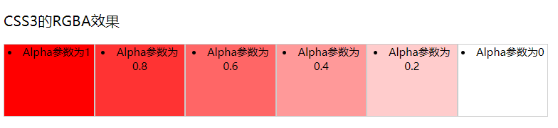
1.RGBA透明度效果
<!DOCTYPE HTML><html><head><title>RGBA透明度</title><style type="text/css">li.rgba {float: left;width: 100px;height: 80px;border: #CCC solid 1px;text-align: center;font-size: 12px;}li.rgba1 {background: rgba(255, 0, 0, 1);}li.rgba2 {background: rgba(255, 0, 0, 0.8);}li.rgba3 {background: rgba(255, 0, 0, 0.6);}li.rgba4 {background: rgba(255, 0, 0, 0.4);}li.rgba5 {background: rgba(255, 0, 0, 0.2);}li.rgba6 {background: rgba(255, 0, 0, 0);}</style></head><body><div class="example-opacity"><p>CSS3的RGBA效果</p><li class="rgba rgba1">Alpha参数为1 </li><li class="rgba rgba2">Alpha参数为0.8 </li><li class="rgba rgba3">Alpha参数为0.6 </li><li class="rgba rgba4">Alpha参数为0.4 </li><li class="rgba rgba5">Alpha参数为0.2 </li><li class="rgba rgba6">Alpha参数为0 </li></div></body></html>
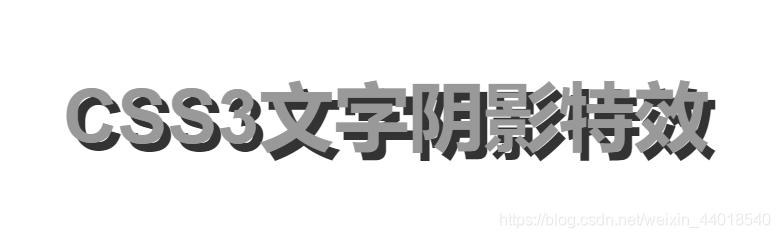
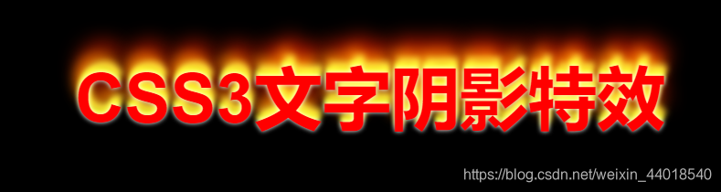
2.文字阴影特效
<!DOCTYPE html><html><head><title>文字阴影特效1</title><style type="text/css">p {text-align: center;font:bold 60px helvetica, arial, sans-serif;color: #999;text-shadow: 0.1em 0.1em #333;}</style></head><body><p>CSS3文字阴影特效</p></body></html>
<!DOCTYPE html><html><head><title>文字阴影特效2</title><style type="text/css">p {text-align: center;font:bold 60px helvetica, arial, sans-serif;color: #fff;text-shadow: black 0.1em 0.1em 0.2em;}</style></head><body><p>CSS3文字阴影特效</p></body></html>

<!DOCTYPE html><html><head><title>文字阴影特效3</title><style type="text/css">body {background:#000;}p {text-align: center;font:bold 60px helvetica, arial, sans-serif;color: red;text-shadow: 0 0 4px white,0 -5px 4px #ff3,2px -10px 6px #fd3,-2px -15px 11px #f80,2px -25px 18px #f20;}</style></head><body><p>CSS3文字阴影特效</p></body></html>
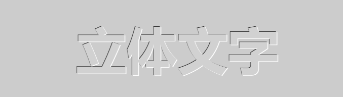
3.立体文字
<!DOCTYPE html><html><head><title>立体文字1</title><style type="text/css">body {background: #000;}p {text-align: center;padding: 24px;margin: 0;font-family: helvetica, arial, sans-serif;font-size: 80px;font-weight: bold;color: #D1D1D1;background: #CCC;text-shadow: -1px -1px white, 1px 1px #333;}</style></head><body><p> 立体文字</p></body></html>

<!DOCTYPE html><html><head><title>立体文字1</title><style type="text/css">body {background: #000;}p {text-align: center;padding: 24px;margin: 0;font-family: helvetica, arial, sans-serif;font-size: 80px;font-weight: bold;color: #D1D1D1;background: #CCC;text-shadow: 1px 1px white, -1px -1px #333;}</style></head><body><p> 立体文字</p></body></html>
总结
怎么样?看过这几个具体的案例之后,有没有对CSS的应用有一个直观的印象呢?
当然,CSS应用的方面肯定不止这些,下次的博客中我们来讲一讲关于CSS鼠标悬停动画的一些实际案例,让用户与网页有些简单的交互!
结语
如果说这篇文章有让你学到一定的知识的话,不妨点个赞和关注,让博主能够看到。如果讲解中有什么错误和疏忽,也劳烦在评论中指出或提问,博主会第一时间进行更新和答复,谢谢!


 青旅半醒
青旅半醒 Bertha 。
 柔情只为你懂
 野性酷女
野性酷女")


还没有评论,来说两句吧...