vue-awesome-swiper
安装
npm install vue-awesome-swiper@3
引用
/*全局引入*/import VueAwesomeSwiper from 'vue-awesome-swiper';import "swiper/dist/css/swiper.css"; //这里注意具体看使用的版本是否需要引入样式,以及具体位置Vue.use(VueAwesomeSwiper, /* { default global options } */);/*组件方式引用*/import { swiper, swiperSlide } from 'vue-awesome-swiper'import 'swiper/dist/css/swiper.css'这里注意具体看使用的版本是否需要引入样式,以及具体位置export default {components: { swiper, swiperSlide}
使用
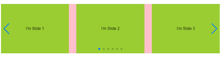
<div class="recommendPage"><swiper :options="swiperOption" ref="mySwiper"> <swiper-slide v-for="(item,index) in swiperList" :key="index"> { {item.text}} </swiper-slide> <!-- 滚动条 --> <div class="swiper-scrollbar" slot="scrollbar"></div> <!-- 标页码 --> <div class="swiper-pagination" slot="pagination"></div> <!-- 上一页 --> <div class="swiper-button-prev" slot="button-prev"></div> <!-- 下一页 --> <div class="swiper-button-next" slot="button-next"></div> </swiper></div>// 局部引入插件import { swiper, swiperSlide } from "vue-awesome-swiper";import "swiper/dist/css/swiper.css";export default { components: { swiper, swiperSlide, }, data() { return { swiperList:[ { text:"I'm Slide 1",}, { text:"I'm Slide 2",}, { text:"I'm Slide 3",}, { text:"I'm Slide 4",}, { text:"I'm Slide 5",}, { text:"I'm Slide 6",}, ], swiperOption: { loop: true, notNextTick: true, // notNextTick是一个组件自有属性,如果notNextTick设置为true,组件则不会通过NextTick来实例化swiper,也就意味着你可以在第一时间获取到swiper对象,假如你需要刚加载遍使用获取swiper对象来做什么事,那么这个属性一定要是true slidesPerView: 3, //数量 spaceBetween: 30, //间距 slidesPerGroup: 1, //分几组 direction: "horizontal", //设置水平还是垂直vertical // grabCursor: true, //光标样式 // setWrapperSize: true, // autoHeight: true, // centeredSlides: true, // paginationClickable: true, // keyboard: true, //键盘控制 // mousewheelControl: true, //鼠标轮控制 autoplay: { delay: 3000, //自动切换的时间间隔,单位ms stopOnLastSlide: false, //当切换到最后一个slide时停止自动切换 disableOnInteraction: false, //用户操作swiper之后,是否禁止autoplay // reverseDirection: false, //开启反向自动轮播 // waitForTransition: true, //等待过渡完毕。自动切换会在slide过渡完毕后才开始计时 }, // 显示分页 pagination: { el: ".swiper-pagination", clickable: true, //允许分页点击跳转 }, // 设置点击箭头 navigation: { nextEl: ".swiper-button-next", prevEl: ".swiper-button-prev", }, }, }; }, computed: { swiper() { return this.$refs.mySwiper.swiper; }, }, mounted() { // current swiper instance // 然后你就可以使用当前上下文内的swiper对象去做你想做的事了 console.log("this is current swiper instance object", this.swiper); // this.swiper.slideTo(3, 1000, false); //只有一张图片时不轮播 // this.swiperOption.autoplay = // this.swiperList.length != 1 // ? { // disableOnInteraction: false, // 用户操作swiper之后,是否禁止autoplay // delay: 3000, // 自动切换的时间间隔(单位ms) // } // : false; },};
可选参数列表
fadeEffect: { crossFade: false, }cubeEffect: { slideShadows: true, //开启slide阴影。默认 true。 shadow: true, //开启投影。默认 true。 shadowOffset: 100, //投影距离。默认 20,单位px。 shadowScale: 0.6 //投影缩放比例。默认0.94。 },coverflowEffect: { rotate: 30, //slide做3d旋转时Y轴的旋转角度。默认50。 stretch: 10, //每个slide之间的拉伸值,越大slide靠得越紧。 默认0。 depth: 60, //slide的位置深度。值越大z轴距离越远,看起来越小。 默认100。 modifier: 2, //depth和rotate和stretch的倍率,相当于depth*modifier、rotate*modifier、stretch*modifier,值越大这三个参数的效果越明显。默认1。 slideShadows : true //开启slide阴影。默认 true。 },flipEffect: { slideShadows : true, //slides的阴影。默认true。 limitRotation : true, //限制最大旋转角度为180度,默认true。 }zoom: { maxRatio: 5, //最大倍数 minRatio: 2, //最小倍数 toggle: false, //不允许双击缩放,只允许手机端触摸缩放。 containerClass: 'my-zoom-container', //zoom container 类名 },navigation: { nextEl: '.swiper-button-next', //前进按钮的css选择器或HTML元素。 prevEl: '.swiper-button-prev', //后退按钮的css选择器或HTML元素。 hideOnClick: true, //点击slide时显示/隐藏按钮 disabledClass: 'my-button-disabled', //前进后退按钮不可用时的类名。 hiddenClass: 'my-button-hidden', //按钮隐藏时的Class },pagination: { el: '.swiper-pagination', type: 'bullets', //type: 'fraction', //type : 'progressbar', //type : 'custom', progressbarOpposite: true, //使进度条分页器与Swiper的direction参数相反 bulletElement : 'li', //设定分页器指示器(小点)的HTML标签。 dynamicBullets: true, //动态分页器,当你的slide很多时,开启后,分页器小点的数量会部分隐藏。 dynamicMainBullets: 2, //动态分页器的主指示点的数量 hideOnClick: true, //默认分页器会一直显示。这个选项设置为true时点击Swiper会隐藏/显示分页器。 clickable: true, //此参数设置为true时,点击分页器的指示点分页器会控制Swiper切换。 },scrollbar: { el: '.swiper-scrollbar', hide: true, //滚动条是否自动隐藏。默认:false,不会自动隐藏。 draggable: true, //该参数设置为true时允许拖动滚动条。 snapOnRelease: true, //如果设置为false,释放滚动条时slide不会自动贴合。 dragSize: 30, //设置滚动条指示的尺寸。默认'auto': 自动,或者设置num(px)。 },


 朱雀
朱雀 骑猪看日落
骑猪看日落 爱被打了一巴掌
 妖狐艹你老母
 我会带着你远行
 ╰+哭是因爲堅強的太久メ
 系统管理员
系统管理员


还没有评论,来说两句吧...