uniapp 电商app签到功能实现
签到功能
目前公司所做的电商app要做一个签到送津贴的页面。接口还在开发中,页面已经搭完了。
页面展示如下:

在页面搭建的过程中,遇到几个小问题,下面做一下记录并汇总一下解决方法。
uniapp 标题栏透明
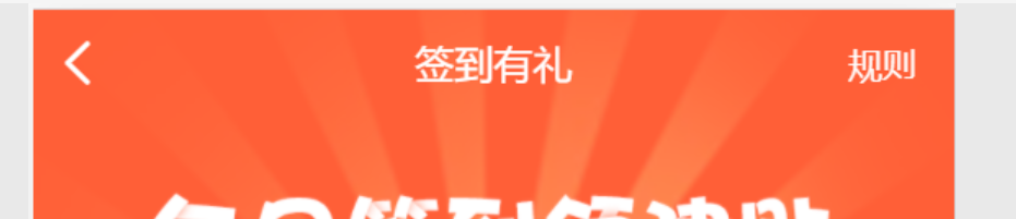
要想实现这种透明的标题栏,就得自定义标题栏了。
首先:
pages.json文件中:
{"path": "pages/user/sign","style": {"navigationBarTitleText": "签到有礼","navigationStyle":"custom"}},
navigationStyle参数设置为custom即可以将标题栏设置为自定义的情况。
如果自己写一个标题栏,为了保证各种手机型号的兼容性,我还是倾向于用现有的组件。
自定义的标题栏组件如下:
这个自定义的标题栏是功能比较全的了,但是没有实现中间是搜索框的那种情况。后续会讲到这种情况的处理方案。
<template><view class="uni-navbar"><view :class="{ 'uni-navbar--fixed': fixed, 'uni-navbar--shadow': shadow, 'uni-navbar--border': border }" :style="{ 'background-color': backgroundColor }" class="uni-navbar__content"><uni-status-bar v-if="statusBar" /><view :style="{ color: color,backgroundColor: backgroundColor }" class="uni-navbar__header uni-navbar__content_view"><view @tap="onClickLeft" class="uni-navbar__header-btns uni-navbar__header-btns-left uni-navbar__content_view"><view class="uni-navbar__content_view" v-if="leftIcon.length"><uni-icons :color="color" :type="leftIcon" size="24" /></view><view :class="{ 'uni-navbar-btn-icon-left': !leftIcon.length }" class="uni-navbar-btn-text uni-navbar__content_view" v-if="leftText.length"><text :style="{ color: color, fontSize: '14px' }">{ { leftText }}</text></view><slot name="left" /></view><view class="uni-navbar__header-container uni-navbar__content_view"><view class="uni-navbar__header-container-inner uni-navbar__content_view" v-if="title.length"><text class="uni-nav-bar-text" :style="{color: color }">{ { title }}</text></view><!-- 标题插槽 --><slot /></view><view :class="title.length ? 'uni-navbar__header-btns-right' : ''" @click="onClickRight" class="uni-navbar__header-btns uni-navbar__content_view"><view class="uni-navbar__content_view" v-if="rightIcon.length"><uni-icons :color="color" :type="rightIcon" size="24" /></view><!-- 优先显示图标 --><view class="uni-navbar-btn-text uni-navbar__content_view" v-if="rightText.length && !rightIcon.length"><text class="uni-nav-bar-right-text">{ { rightText }}</text></view><slot name="right" /></view></view></view><view class="uni-navbar__placeholder" v-if="fixed"><uni-status-bar v-if="statusBar" /><view class="uni-navbar__placeholder-view" /></view></view></template><script>import uniStatusBar from "@/components/uni-status-bar/uni-status-bar.vue";import uniIcons from "@/components/uni-icons/uni-icons.vue";/** * NavBar 自定义导航栏 * @description 导航栏组件,主要用于头部导航 * @tutorial https://ext.dcloud.net.cn/plugin?id=52 * @property {String} title 标题文字 * @property {String} leftText 左侧按钮文本 * @property {String} rightText 右侧按钮文本 * @property {String} leftIcon 左侧按钮图标(图标类型参考 [Icon 图标](http://ext.dcloud.net.cn/plugin?id=28) type 属性) * @property {String} rightIcon 右侧按钮图标(图标类型参考 [Icon 图标](http://ext.dcloud.net.cn/plugin?id=28) type 属性) * @property {String} color 图标和文字颜色 * @property {String} backgroundColor 导航栏背景颜色 * @property {Boolean} fixed = [true|false] 是否固定顶部 * @property {Boolean} statusBar = [true|false] 是否包含状态栏 * @property {Boolean} shadow = [true|false] 导航栏下是否有阴影 * @event {Function} clickLeft 左侧按钮点击时触发 * @event {Function} clickRight 右侧按钮点击时触发 */export default {name: "UniNavBar",components: {uniStatusBar,uniIcons},props: {title: {type: String,default: ""},leftText: {type: String,default: ""},rightText: {type: String,default: ""},leftIcon: {type: String,default: ""},rightIcon: {type: String,default: ""},fixed: {type: [Boolean, String],default: false},color: {type: String,default: "#000000"},backgroundColor: {type: String,default: "#FFFFFF"},statusBar: {type: [Boolean, String],default: false},shadow: {type: [Boolean, String],default: false},border: {type: [Boolean, String],default: true}},mounted() {if (uni.report && this.title !== '') {uni.report('title', this.title)}},methods: {onClickLeft() {this.$emit("clickLeft");},onClickRight() {console.log("规则页面");}}};</script><style scoped>.uni-nav-bar-text {/* #ifdef APP-PLUS */font-size: 34rpx;/* #endif *//* #ifndef APP-PLUS */font-size: 32rpx;/* #endif */}.uni-nav-bar-right-text {font-size: 28rpx;}.uni-navbar__content {position: relative;background-color: #ffffff;overflow: hidden;}.uni-navbar__content_view {/* #ifndef APP-NVUE */display: flex;/* #endif */align-items: center;flex-direction: row;/* background-color: #FFFFFF; */}.uni-navbar__header {/* #ifndef APP-NVUE */display: flex;/* #endif */flex-direction: row;height: 44px;line-height: 44px;font-size: 16px;/* background-color: #ffffff; */}.uni-navbar__header-btns {/* #ifndef APP-NVUE */display: flex;/* #endif */flex-wrap: nowrap;width: 120rpx;padding: 0 6px;justify-content: center;align-items: center;}.uni-navbar__header-btns-left {/* #ifndef APP-NVUE */display: flex;/* #endif */width: 150rpx;justify-content: flex-start;}.uni-navbar__header-btns-right {/* #ifndef APP-NVUE */display: flex;/* #endif */width: 150rpx;padding-right: 30rpx;justify-content: flex-end;}.uni-navbar__header-container {flex: 1;}.uni-navbar__header-container-inner {/* #ifndef APP-NVUE */display: flex;/* #endif */flex: 1;align-items: center;justify-content: center;font-size: 28rpx;}.uni-navbar__placeholder-view {height: 44px;}.uni-navbar--fixed {position: fixed;z-index: 998;}.uni-navbar--shadow {/* #ifndef APP-NVUE */box-shadow: 0 1px 6px #ccc;/* #endif */}.uni-navbar--border {/* border-bottom-width: 1rpx; border-bottom-style: solid; border-bottom-color: #e5e5e5; */}</style>
上面的这个组件比较麻烦,可以通过下面的组件进行封装一下,完全可以满足普通的标题栏的方案:
普通的标题栏都是可以满足的,左右侧按钮,背景颜色,字体颜色等都是可以设置的。
封装如下:
<template><uni-nav-bar:title="title"leftIcon="arrowleft":statusBar="true"@clickLeft="clickLeft":fixed="true":shadow="shadow":backgroundColor="backgroundColor":rightText="rightText":color="color"/></template><script>import uniNavBar from '@/components/uni-nav-bar/uni-nav-bar.vue'export default {components:{ uniNavBar},props:{title:{type:String,default:"标题"},shadow:{type:Boolean,default:false},backgroundColor:{type:String,default:null},color:{type:String,default:"#000"},rightText:{type:String,default:""}},methods:{clickLeft(){uni.navigateBack({delta:1})}}}</script>
为了实现透明的标题栏,只需要将上面封装好的组件中的背景颜色改为透明色即可。
签到部分七天的渲染
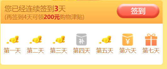
渲染签到部分的时候,出现了一个图片展示不出来的问题。浏览器端是可以i展示的,但是app端不展示。
最终改为下面的这种展示形式:<image :src="item.status==0?'/static/sign/money.png':(item.status==1?'/static/sign/bu.png':(item.status==2?'/static/sign/redBag.png':(item.status==3?'/static/sign/gift.png':'/static/sign/giftOpen.png')))" mode="heightFix"></image> 就可以了。
图片展示不出来,是因为image标签不支持本地图片与动态图片的同时展示,如果根据动态数据来展示不同的本地图片,则可以通过下面的这种方式来处理。就是通过三目运算的这种方式。
<view class="signDay"><view class="dayTit" v-for="(item,index) in dayList" :key="item.num"><image :src="item.status==0?'/static/sign/money.png':(item.status==1?'/static/sign/bu.png':(item.status==2?'/static/sign/redBag.png':(item.status==3?'/static/sign/gift.png':'/static/sign/giftOpen.png')))" mode="heightFix"></image><text>第<text>{ { item.num | dayFilter}}</text>天</text></view></view>
page背景颜色设置失败
由于页面下面部分是分页加载的商品列表,在下拉触底的时候,会自动加载下一页的数据。因此背景颜色我需要设置一下。
给page添加背景颜色的时候,发现设置了不管用。
百度一番后,发现需要去掉style标签上的scoped,page就可以设置成功了。
<style lang="scss">page{width:100vw;height:100vh;width:100%;height:100%;background:#FDE788;}</style>
签到弹窗的处理
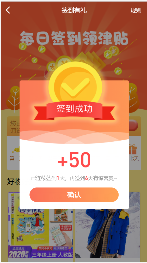
这个就是一个普通的animation.css动画。
这个后续再涉及。
接口处理的过程中,如果有遇到什么问题,我会及时补充。


 旧城等待,
旧城等待, 迷南。
迷南。 柔情只为你懂
 小鱼儿
小鱼儿 你的名字
你的名字


还没有评论,来说两句吧...