CSS水平居中+垂直居中+水平/垂直居中的方法总结
转载一位大佬的
CSS水平居中+垂直居中+水平/垂直居中的方法总结_一只前端小菜鸟~的博客-CSDN博客_垂直居中的方法
分享一篇我的博客 (详细记载工作中遇到的问题)
前端工作四个月经验总结以及技术分享__揽的博客-CSDN博客
水平居中
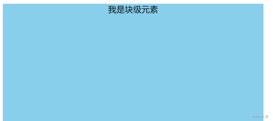
首先看它的父元素是不是块级元素,如果是,则直接给父元素设置 text-align: center;
<style>#father {width: 500px;height: 300px;background-color: skyblue;text-align: center;}</style><div id="father"><span id="son">我是行内元素</span></div>
如果不是,则先将其父元素设置为块级元素,再给父元素设置 text-align: center;
<style>#father {display: block;width: 500px;height: 300px;background-color: skyblue;text-align: center;}</style><span id="father"><span id="son">我是行内元素</span></span>
效果:
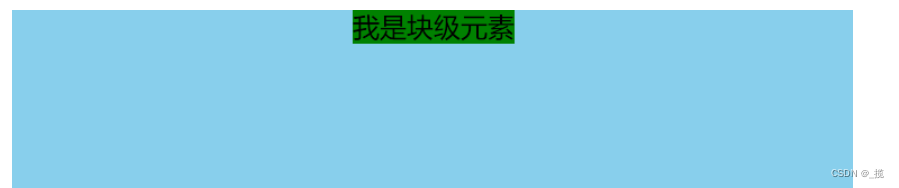
方案一:(分宽度定不定两种情况)
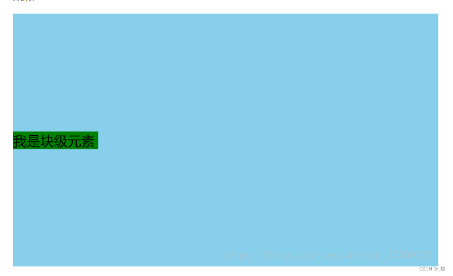
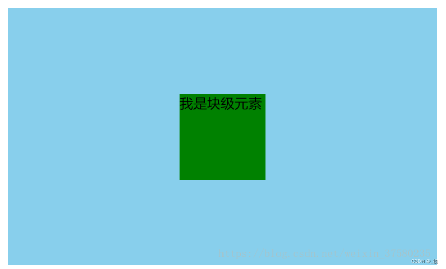
定宽度:需要谁居中,给其设置 margin: 0 auto; (作用:使盒子自己居中)
<style>#father {width: 500px;height: 300px;background-color: skyblue;}#son {width: 100px;height: 100px;background-color: green;margin: 0 auto;}</style><div id="father"><div id="son">我是块级元素</div></div>
效果:
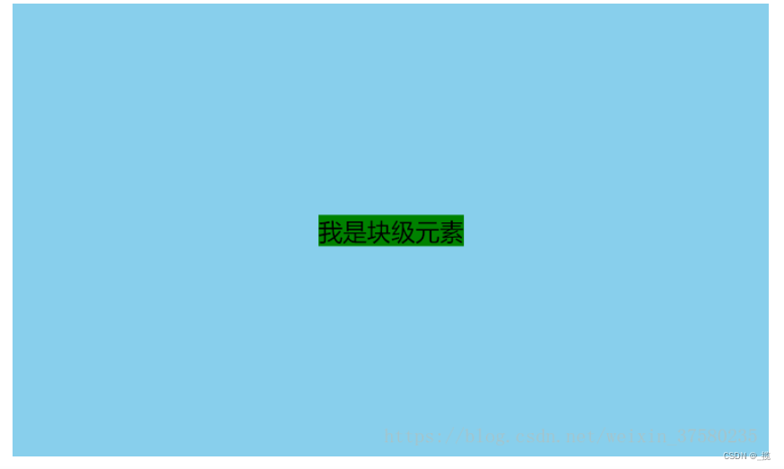
 不定宽度:默认子元素的宽度和父元素一样,这时需要设置子元素为display: inline-block; 或 display: inline;即将其转换成行内块级/行内元素,给父元素设置 text-align: center;
<style>#father {width: 500px;height: 300px;background-color: skyblue;text-align: center;}#son {background-color: green;display: inline;}</style><div id="father"><div id="son">我是块级元素</div></div>
效果:(将#son转换成行内元素,内容的高度撑起了#son的高度,设置高度无用)
方案二:使用定位属性
首先设置父元素为相对定位,再设置子元素为绝对定位,设置子元素的left:50%,即让子元素的左上角水平居中;
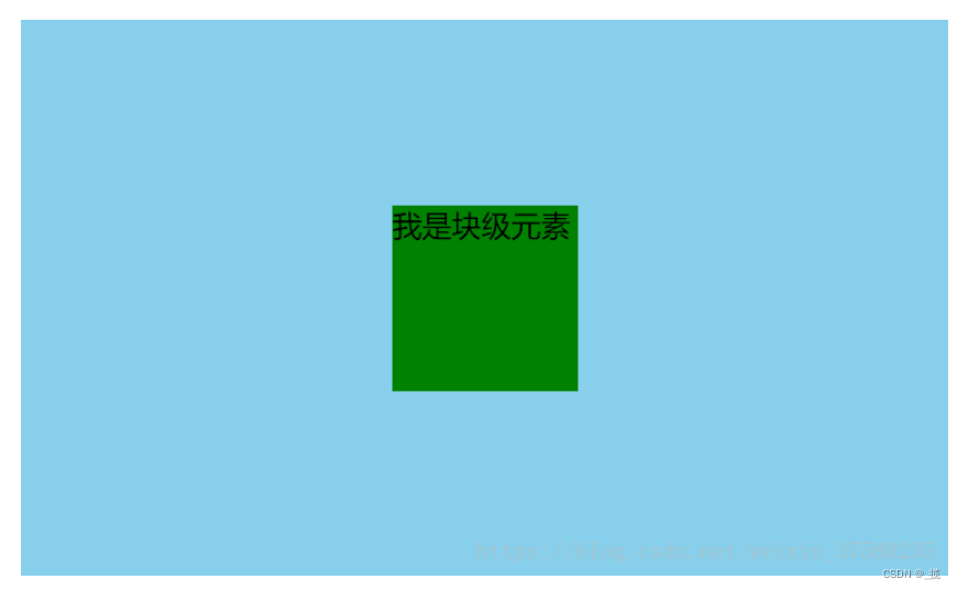
定宽度:设置绝对子元素的 margin-left: -元素宽度的一半px; 或者设置transform: translateX(-50%);
<style>#father {width: 500px;height: 300px;background-color: skyblue;position: relative;}#son {width: 100px;height: 100px;background-color: green;position: absolute;left: 50%;margin-left: -50px;}</style><div id="father"><div id="son">我是块级元素</div></div>
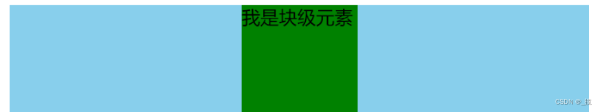
不定宽度:利用css3新增属性transform: translateX(-50%);
<style>#father {width: 500px;height: 300px;background-color: skyblue;position: relative;}#son {height: 100px;background-color: green;position: absolute;left: 50%;transform: translateX(-50%);}</style><div id="father"><div id="son">我是块级元素</div></div>
效果: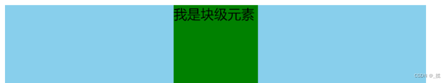
方案三:使用flexbox布局实现(宽度定不定都可以)
使用flexbox布局,只需要给待处理的块状元素的父元素添加属性 display: flex; justify-content: center;
<style>#father {width: 500px;height: 300px;background-color: skyblue;display: flex;justify-content: center;}#son {width: 100px;height: 100px;background-color: green;}</style><div id="father"><div id="son">我是块级元素</div></div>
效果:
垂直居中
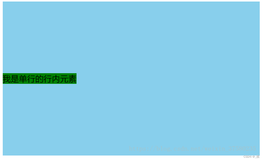
只需要设置单行行内元素的”行高等于盒子的高”即可;
<style>#father {width: 500px;height: 300px;background-color: skyblue;}#son {background-color: green;height: 300px;}</style><div id="father"><span id="son">我是单行的行内元素</span></div>
效果:
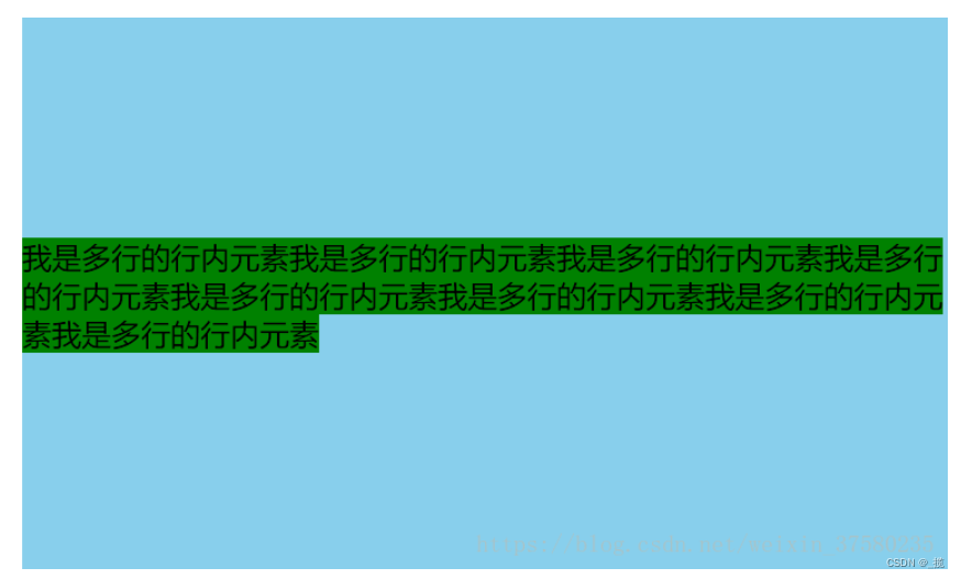
使用给父元素设置display:table-cell;**和**vertical-align: middle;属即可;
<style>#father {width: 500px;height: 300px;background-color: skyblue;display: table-cell;vertical-align:middle;}#son {background-color: green;}</style><div id="father"><span id="son">我是多行的行内元素我是多行的行内元素我是多行的行内元素我是多行的行内元素我是多行的行内元素我是多行的行内元素我是多行的行内元素我是多行的行内元素</span></div>
块级元素 方案一:使用定位 首先设置父元素为相对定位,再设置子元素为绝对定位,设置子元素的top: 50%,即让子元素的左上角垂直居中;
定高度:设置绝对子元素的 margin-top: -元素高度的一半px; 或者设置transform: translateY(-50%);
<style>#father {width: 500px;height: 300px;background-color: skyblue;position: relative;}#son {height: 100px;background-color: green;position: absolute;top: 50%;margin-top: -50px;}</style><div id="father"><div id="son">我是块级元素</div></div>
不定高度:利用css3新增属性transform: translateY(-50%);
<style>#father {width: 500px;height: 300px;background-color: skyblue;position: relative;}#son {width: 100px;background-color: green;position: absolute;left: 50%;transform: translateY(-50%);}</style><div id="father"><div id="son">我是块级元素</div></div>
效果:
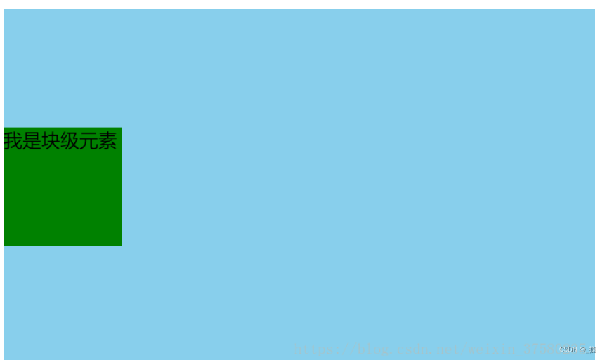
方案二:使用flexbox布局实现(高度定不定都可以)
使用flexbox布局,只需要给待处理的块状元素的父元素添加属性 display: flex; align-items: center;
<style>#father {width: 500px;height: 300px;background-color: skyblue;display: flex;align-items: center;}#son {width: 100px;height: 100px;background-color: green;}</style><div id="father"><div id="son">我是块级元素</div></div>
效果:
水平垂直居中
方案一:设置父元素为相对定位,给子元素设置绝对定位,top: 0; right: 0; bottom: 0; left: 0; margin: auto;
<style>#father {width: 500px;height: 300px;background-color: skyblue;position: relative;}#son {width: 100px;height: 100px;background-color: green;position: absolute;top: 0;right: 0;bottom: 0;left: 0;margin: auto;}</style><div id="father"><div id="son">我是块级元素</div></div>
效果:
方案二:设置父元素为相对定位,给子元素设置绝对定位,left: 50%; top: 50%; margin-left: -**-元素宽度的一半px; margin-top: --元素高度的一半px**;
<style>#father {width: 500px;height: 300px;background-color: skyblue;position: relative;}#son {width: 100px;height: 100px;background-color: green;position: absolute;left: 50%;top: 50%;margin-left: -50px;margin-top: -50px;}</style><div id="father"><div id="son">我是块级元素</div></div>
效果:
方案一:使用定位属性
设置父元素为相对定位,给子元素设置绝对定位,left: 50%; top: 50%; transform: translateX(-50%) translateY(-50%);
<style>#father {width: 500px;height: 300px;background-color: skyblue;position: relative;}#son {background-color: green;position: absolute;left: 50%;top: 50%;transform: translateX(-50%) translateY(-50%);}</style><div id="father"><div id="son">我是块级元素</div></div>
效果:
方案二:使用flex布局实现
设置父元素为flex定位,justify-content: center; align-items: center;
<style>#father {width: 500px;height: 300px;background-color: skyblue;display: flex;justify-content: center;align-items: center;}#son {background-color: green;}</style><div id="father"><div id="son">我是块级元素</div></div>
效果:


 男娘i
男娘i 太过爱你忘了你带给我的痛
 Myth丶恋晨
 不念不忘少年蓝@
 ╰+哭是因爲堅強的太久メ
")


还没有评论,来说两句吧...