CSS垂直水平居中方式大全(一)----水平居中-垂直居中
CSS中的居中可分为水平居中和垂直居中。水平居中分为行内元素居中和块状元素居中两种情况,而块状元素又分为定宽块状元素居中和不定宽块状元素居中。
一、水平居中
1、行内元素居中
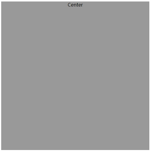
顾名思义,行内元素居中是只针对行内元素的,比如文本(text)、图片(img)、按钮等行内元素,可通过给父元素设置 text-align:center 来实现。另外,如果块状元素属性display 被设置为inline时,也是可以使用这种方法。但有个首要条件是子元素必须没有被float影响,否则一切都是无用功。
示例:
<!DOCTYPE html><html><head><meta charset="UTF-8"><title>居中</title><style>.div1{text-align:center;width: 500px;height: 500px;background: #999999;}</style></head><body><div class="div1">Center</div></body></html>
效果:
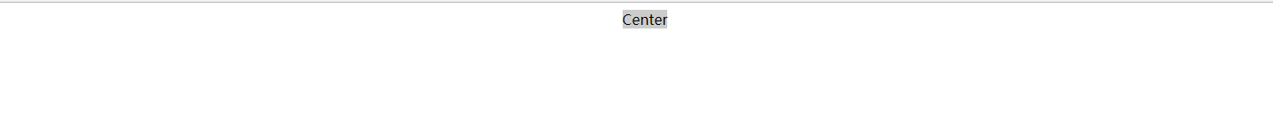
2、块状元素居中
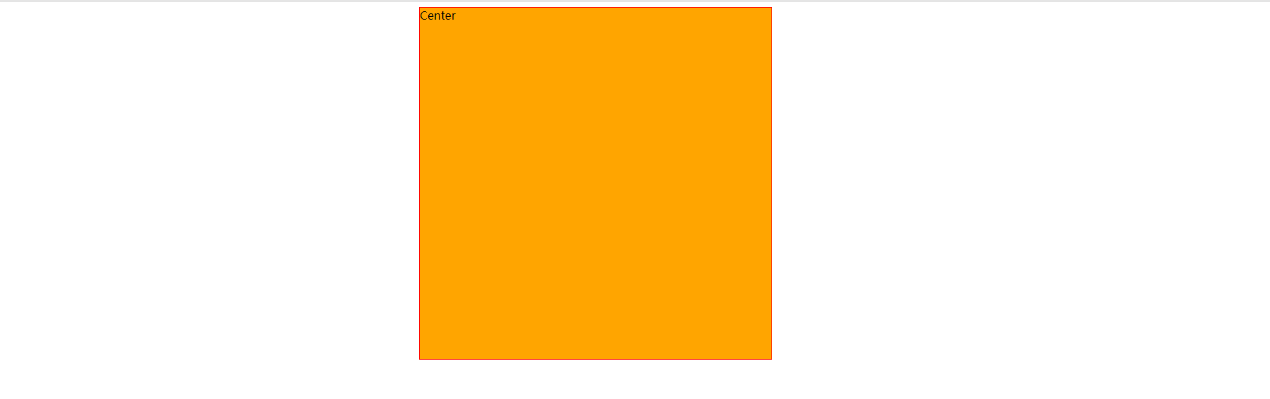
(1)、定宽块状元素居中
满足定宽(块状元素的宽度width为固定值)和块状两个条件的元素可以通过设置“左右margin”值为“auto”来实现居中。
示例:
<!DOCTYPE html><html><head><meta charset="UTF-8"><title>居中</title><style>.div1{width: 500px;height: 500px;background: #FFA500;border:1px solid red;margin:0 auto;}</style></head><body><div class="div1">Center</div></body></html>
效果:
(2)、不定宽块状元素居中
在实际工作中我们会遇到需要为“不定宽度的块状元素”设置居中,比如网页上的分页导航,因为分页的数量是不确定的,所以我们不能通过设置宽度来限制它的弹性。(不定宽块状元素:块状元素的宽度width不固定。)
有三种方法可以对不定宽块状元素进行居中:
方法1:
将要显示的元素加入到 table 标签当中,然后为 table 标签设置“左右margin”值为“auto”来实现居中;
示例:
<!DOCTYPE html><html><head><meta charset="UTF-8"><title>居中</title><style>table{margin:0 auto;}</style></head><body><div><table><tbody><tr><td><div style="width: 100px;height: 100px;background: #FFA500;">Center</div></td></tr></tbody></table></div></body></html>
效果:
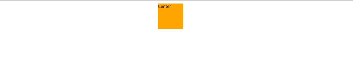
或使用 display : table;然后设该元素“左右margin”值为“auto”来实现居中。后面的display:table; 方法会更简洁。
示例:
<!DOCTYPE html><html><head><meta charset="UTF-8"><title>居中</title><style>.wrap{width: 100px;height: 100px;background:#ccc;display:table;margin:0 auto;}</style></head><body><div class="wrap">Center</div></body></html>
效果: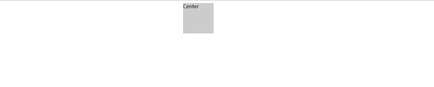
为什么加入table标签? 是利用table标签的长度自适应性—-即不定义其长度也不默认父元素body的长度(table其长度根据其内文本长度决定),因此可以看做一个定宽度块元素,然后再利用定宽度块状居中的margin的方法,使其水平居中。
方法2:
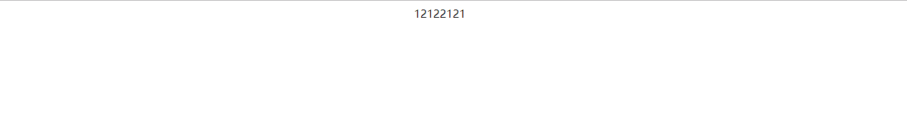
改变块级元素的 display 为 inline 类型(设置为 行内元素 显示),然后使用 text-align:center 来实现居中效果。
这种方法相比第一种方法的优势是不用增加无语义标签,但也存在着一些问题:它将块状元素的 display 类型改为 inline,变成了行内元素,所以少了一些功能,比如设定长度值(变成inline-block就可以设置宽高)。
示例:
<!DOCTYPE html><html><head><meta charset="UTF-8"><title>居中</title><style>.container{text-align:center;}.container div{list-style:none;margin:0;padding:0;display:inline;}</style></head><body><div class="container"><div>12122121</div></div></body></html>
效果:
方法3:
通过给父元素设置 float,然后给父元素设置 position:relative 和 left:50%,子元素设置 position:relative 和 left: -50% 来实现水平居中。
示例:
<!DOCTYPE html><html><head><meta charset="UTF-8"><title>居中</title><style>.wrap{float:left;position:relative;left:50%;clear:both;}.wrap-center{background:#ccc;position:relative;left:-50%;}</style></head><body><div class="wrap"><div class="wrap-center">Center</div></div></body></html>
效果:
先设置父元素wrap清除浮动,然后左浮动。定位让wrap向右偏移50%。然后定义子元素相对于父元素向左偏移50%。脱离父元素。
二、垂直居中
垂直居中可分为父元素高度确定的单行文本,以及父元素高度确定的多行文本。
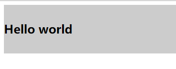
1、父元素高度确定的单行文本的竖直居中的方法是通过设置父元素的 height 和 line-height 高度一致来实现的。(height: 该元素的高度,line-height: 顾名思义,行高,指在文本中,行与行之间的 基线间的距离 )。
示例:
<!DOCTYPE html><html><head><meta charset="UTF-8"><title>居中</title><style>.wrap h2{margin:0;height:100px;line-height:100px;background:#ccc;}</style></head><body><div class="wrap"><h2>Hello world</h2></div></body></html>
效果:
说明:
line-height(行高) 的值不能设为100%,我们来看看官方文档中给出的关于line-height取值为百分比时候的描述:基于当前字体尺寸的百分比行间距。这里的百分比并不是相对于父元素尺寸而言,而是相对于字体尺寸来讲的。
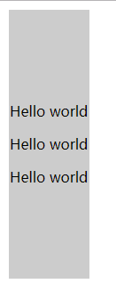
2、父元素高度确定的多行文本
有两种方法:
方法1:
使用插入 table (包括tbody、tr、td)标签,同时设置 vertical-align:middle。
示例1:
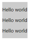
<!DOCTYPE html><html><head><meta charset="UTF-8"><title>居中</title><style>.wrap{height:300px;background:#ccc;vertical-align:middle; /* td 标签默认情况下就默认设置了 vertical-align 为 middle,可以不需要显式地设置 */}</style></head><body><table><tbody><tr><td class="wrap"><div><p>Hello world</p><p>Hello world</p><p>Hello world</p></div></td></tr></tbody></table></body></html>
效果1:
示例2:
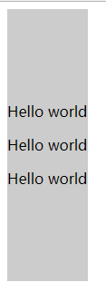
<!DOCTYPE html><html><head><meta charset="UTF-8"><title>居中</title><style>.wrap{background:#ccc;display:table;vertical-align:middle;}</style></head><body><div class="wrap"><p>Hello world</p><p>Hello world</p><p>Hello world</p></div></body></html>
效果2:
方法2:
设置块级元素的 display 为 table-cell(设置为表格单元显示),激活 vertical-align 属性。但这种方法兼容性比较差, IE6、7 并不支持这个样式。
示例:
<!DOCTYPE html><html><head><meta charset="UTF-8"><title>居中</title><style>.wrap{height:300px;background:#ccc;display:table-cell;/*IE8以上及Chrome、Firefox*/vertical-align:middle;/*IE8以上及Chrome、Firefox*/}</style></head><body><div class="wrap"><p>Hello world</p><p>Hello world</p><p>Hello world</p></div></body></html>
效果:
还可以通过以下一些方式来实现垂直居中:
1.使用绝对定位和负外边距对块级元素进行垂直居中:
示例:
<!DOCTYPE html><html><head><meta charset="UTF-8"><title>居中</title><style>#box {width: 300px;height: 300px;background: #ddd;position: relative;}#child {width: 150px;height: 100px;background: orange;position: absolute;top: 50%;margin: -50px 0 0 0;line-height: 100px;}</style></head><body><div id="box"><div id="child">Hello world</div></div></body></html>
效果:
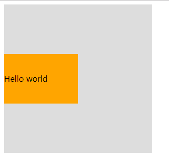
说明:
必须提前知道被居中块级元素的尺寸,否则无法准确实现垂直居中。
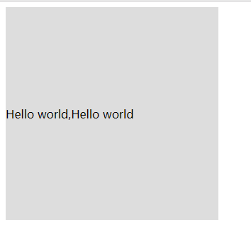
2.使用绝对定位和transform
示例:
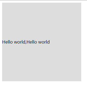
<!DOCTYPE html><html><head><meta charset="UTF-8"><title>居中</title><style>#box {width: 300px;height: 300px;background: #ddd;position: relative;}#child {background: #93BC49;position: absolute;top: 50%;transform: translate(0, -50%);}</style></head><body><div id="box"><div id="child">Hello world,Hello world,Hello worldHello world</div></div></body></html>
效果:
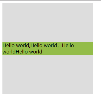
说明:
这种方法有一个非常明显的好处就是不必提前知道被居中元素的尺寸了,因为transform中translate偏移的百分比就是相对于元素自身的尺寸而言的。
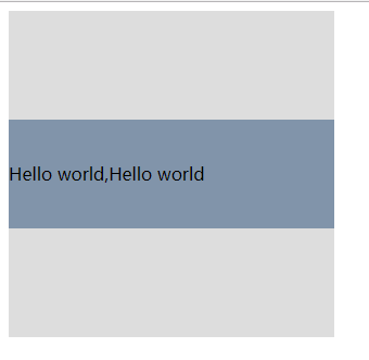
3.另外一种使用绝对定位和负外边距进行垂直居中的方式
示例:
<!DOCTYPE html><html><head><meta charset="UTF-8"><title>居中</title><style>#box {width: 300px;height: 300px;background: #ddd;position: relative;}#child {width: 50%;height: 30%;background: pink;position: absolute;top: 50%;margin: -15% 0 0 0;}</style></head><body><div id="box"><div id="child">Hello world,Hello world,Hello worldHello world</div></div></body></html>
效果:
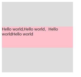
说明:
这种方式的原理实质上和前两种相同。margin的取值也可以是百分比,这时这个值规定了该元素基于父元素尺寸的百分比,可以根据实际的使用场景来决定是用具体的数值还是用百分比。
4.绝对定位结合margin: auto
示例:
<!DOCTYPE html><html><head><meta charset="UTF-8"><title>居中</title><style>#box {width: 300px;height: 300px;background: #ddd;position: relative;}#child {width: 200px;height: 100px;background: #A1CCFE;position: absolute;top: 0;bottom: 0;margin: auto;line-height: 100px;}</style></head><body><div id="box"><div id="child">Hello world,Hello world</div></div></body></html>
效果:
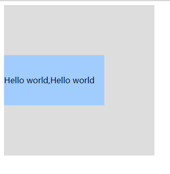
说明:
这种实现方式的两个核心是:把要垂直居中的元素相对于父元素绝对定位,top和bottom设为相等的值,我这里设成了0,当然你也可以设为99999px或者-99999px无论什么,只要两者相等就行,这一步做完之后再将要居中元素的margin设为auto,这样便可以实现垂直居中了。
被居中元素的宽高也可以不设置,但不设置的话就必须是图片这种自身就包含尺寸的元素,否则无法实现。
5.使用padding实现子元素的垂直居中
示例:
<!DOCTYPE html><html><head><meta charset="UTF-8"><title>居中</title><style>#box {width: 300px;background: #ddd;padding: 100px 0;}#child {width: 200px;height: 100px;background: #F7A750;line-height: 50px;}</style></head><body><div id="box"><div id="child">Hello world,Hello world</div></div></body></html>
效果:
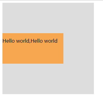
说明:
这种实现方式非常简单,就是给父元素设置相等的上下内边距,则子元素自然是垂直居中的,当然这时候父元素是不能设置高度的,要让它自动被填充起来,除非设置了一个正好等于上内边距+子元素高度+下内边距的值,否则无法精确的垂直居中。
6.设置第三方基准
示例:
<!DOCTYPE html><html><head><meta charset="UTF-8"><title>居中</title><style>#box {width: 300px;height: 300px;background: #ddd;}#base {height: 50%;background: #AF9BD3;}#child {height: 100px;background: rgba(131, 224, 245, 0.6);line-height: 50px;margin-top: -50px;}</style></head><body><div id="box"><div id="base"></div><div id="child">Hello world,Hello world</div></div></body></html>
效果:
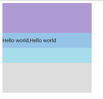
说明:
这种方式也非常简单,首先设置一个高度等于父元素高度一半的第三方基准元素,那么此时该基准元素的底边线自然就是父元素纵向上的中分线,做完这些之后再给要垂直居中的元素设置一个margin-top,值的大小是它自身高度的一半取负,则实现垂直居中。
7.使用flex布局
示例:
<!DOCTYPE html><html><head><meta charset="UTF-8"><title>居中</title><style>#box {width: 300px;height: 300px;background: #ddd;display: flex;align-items: center;}</style></head><body><div id="box">Hello world,Hello world</div></body></html>
效果:
块级元素示例如下:
示例:
<!DOCTYPE html><html><head><meta charset="UTF-8"><title>居中</title><style>#box {width: 300px;height: 300px;background: #ddd;display: flex;align-items: center;}#child {width: 300px;height: 100px;background: #8194AA;line-height: 100px;}</style></head><body><div id="box"><div id="child">Hello world,Hello world</div></div></body></html>
效果:
8.使用弹性布局的方式
示例:
<!DOCTYPE html><html><head><meta charset="UTF-8"><title>居中</title><style>#box {width: 300px;height: 300px;background: #ddd;display: flex;flex-direction: column;justify-content: center;}#child {width: 300px;height: 100px;background: #08BC67;line-height: 100px;}</style></head><body><div id="box"><div id="child">Hello world,Hello world</div></div></body></html>
效果:
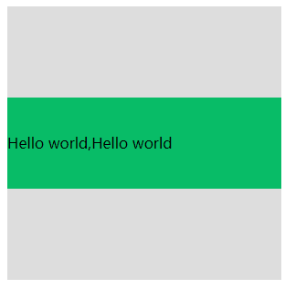
说明:
这种方式也是首先给父元素设置display:flex,设置好之后改变主轴的方向flex-direction: column
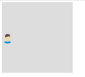
9.使用 line-height 和 vertical-align 对图片进行垂直居中
示例:
<!DOCTYPE html><html><head><meta charset="UTF-8"><title>居中</title><style>#box{width: 300px;height: 300px;background: #ddd;line-height: 300px;}#box img {vertical-align: middle;}</style></head><body><div id="box"><img src="img/user.png"></div></body></html>
效果:
10.使用 display 和 vertical-align 对容器里的文字进行垂直居中
示例:
<!DOCTYPE html><html><head><meta charset="UTF-8"><title>居中</title><style>#box {width: 300px;height: 300px;background: #ddd;display: table;}#child {display: table-cell;vertical-align: middle;}</style></head><body><div id="box"><div id="child">Hello world,Hello world</div></div></body></html>
效果:
说明:
vertical-align属性只对拥有valign特性的html元素起作用,例如表格元素中的等等。
vertical-align属性规定单元格中内容的垂直排列方式,语法:
value的可能取值有四种:
top:对内容进行上对齐
middle:对内容进行居中对齐
bottom:对内容进行下对齐
baseline:基线对齐


 Myth丶恋晨
 r囧r小猫
r囧r小猫 不念不忘少年蓝@
 ゞ 浴缸里的玫瑰

")


")


还没有评论,来说两句吧...