Flutter学习记录——23.实现一个类似淘宝的商品展示页面
文章目录
- 1.知识整理
- 2.应用编写
- 2.1 应用编写目标
- 2.2 应用浏览
- 2.3 应用分析
- 2.4 应用实现
- 3.总结
经过前面两大部分的详细讲解,相信大家对大部分的布局方式、组件的使用、逻辑业务编写都有了很深入的了解,那么接下来我们就用前面学习的一些知识来进行一个实践:实现一个淘宝风格的商品展示列表,通过这个实例我们可以复习巩固我们之前学过的知识,也算是一个总结与检验。本课练习篇主要是将通过一些组件、自定义组件、常用布局等知识点来完成一个淘宝风格的商品展示列表,一起来学习吧,很简单!
1.知识整理
在进行案例编写前,我们先整理下我们前面学习过的 Flutter 相关 Widget:
- 基础组件(Text、Image、Button)
- 基础组件(AppBar、AlertDialog、Icon)
- 基础组件(TextField、Form表单)
- 基础布局(Scaffold、Container、Center)
- 基础布局(Row、Column、Flex、Expanded、Stack、IndexedStack)
- 列表滚动组件(CustomScrollView、ListView、ScrollView、ExpansionPanel)
- 导航组件(TabBar、NavigationBar、PageView)
- 流式布局组件(Flow、Wrap)
- 表格组件(Table、Data Tables)
- 自定义组件
那么我们这节实践课,就通过以上我们学过的一些 Widget 和技术来布局一个淘宝商品列表的应用页面,练练手,也对之前的知识加深一下印象。
2.应用编写
2.1 应用编写目标
本节博客将用前面所学的一些布局 Widget 和组件 Widget 来编写一个淘宝商品列表的应用页面。
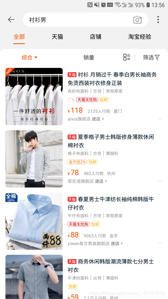
2.2 应用浏览
2.3 应用分析
里面涉及到: Scaffold、Container、Row、Column、TextField、AppBar、Text、Image、FloatingActionButton、Icon、ClipRRect、CustomScrollView、SliverPersistentHeader、TabBar、TabBarView 等。
首先分析下这个页面,我们主要是进行 Item 页面的绘制和顶部 Tab 页的效果绘制。我们这里可以使用 Scaffold 构建页面布局框架,然后使用 TabBar 实现顶部的 Tab 页效果。TabBar 的切换页面的 body 显示部分,使用TabBarView 实现。
Item 的布局结构部分,我们通过效果图可以看出,外层可以使用 Column 纵向线性布局 Widget,图片圆角部分处理美化,使用 ClipRRect 和 BoxDecoration 进行圆角处理。
2.4 应用实现
代码实现:
import 'package:flutter/material.dart';import 'package:flutter/rendering.dart';/// 实现一个淘宝风格的商品展示列表class PracticeTwoSamples extends StatefulWidget {@overrideState<StatefulWidget> createState() {return PracticeTwoSamplesState();}}class PracticeTwoSamplesState extends State<PracticeTwoSamples>with SingleTickerProviderStateMixin {// 页面切换TabControllerTabController _tabController;@overridevoid initState() {super.initState();_tabController = TabController(initialIndex: 0, length: 4, vsync: this);}@overrideWidget build(BuildContext context) {return Scaffold(// 定义顶部标题栏appBar: AppBar(primary: true,elevation: 0,automaticallyImplyLeading: true,title: Container(padding: EdgeInsets.only(left: 0, right: 0, top: 10, bottom: 10),child: TextField(maxLines: 1,autofocus: false,// TextFiled装饰decoration: InputDecoration(filled: true,contentPadding: EdgeInsets.all(10),fillColor: Colors.white,border: OutlineInputBorder(borderSide: BorderSide.none,gapPadding: 0,borderRadius: BorderRadius.all(Radius.circular(20))),hintText: '衬衫男',suffixIcon: Icon(Icons.photo_camera)),),),centerTitle: true,// 右侧收起的更多按钮菜单actions: <Widget>[PopupMenuButton(itemBuilder: (BuildContext context) => <PopupMenuItem<String>>[PopupMenuItem<String>(child: Text("消息"),value: "message",),PopupMenuItem<String>(child: Text("分享"),value: "share",),],onSelected: (String action) {switch (action) {case "message":print("message");break;case "share":print("share");break;}},onCanceled: () {print("onCanceled");},)],// 紧挨着标题栏AppBar的TabBarbottom: TabBar(controller: _tabController,isScrollable: false,// 标签选中颜色labelColor: Color.fromRGBO(247, 70, 0, 1),unselectedLabelColor: Colors.black,indicatorColor: Color.fromRGBO(247, 70, 0, 1),indicatorSize: TabBarIndicatorSize.label,// 几个Tab按钮tabs: <Widget>[Tab(text: "全部",),Tab(text: "天猫",),Tab(text: "店铺",),Tab(text: "淘宝经验",),],),),// 右下角悬浮的按钮ButtonfloatingActionButton: FloatingActionButton(backgroundColor: Colors.white,onPressed: () { },mini: true,elevation: 1,highlightElevation: 2,child: Icon(Icons.vertical_align_top,),),// 主体部分布局内容,使用了TabBarViewbody: TabBarView(controller: _tabController,// 内部切换页布局内容children: <Widget>[getPage1(),getPage1(),Center(child: Text("data3"),),Center(child: Text("data4"),),],),);}// 将页面布局单独提取出来写,方便Widget getPage1() {// 建议最外层使用Container包裹一层return Container(padding: EdgeInsets.all(10),decoration: BoxDecoration(color: Colors.white,borderRadius: BorderRadius.only(topLeft: Radius.circular(30), topRight: Radius.circular(30))),// 内部页面使用CustomScrollView来实现滚动效果child: CustomScrollView(slivers: <Widget>[// 放置一个可推上去的顶部的标题栏SliverPersistentHeader(floating: true,delegate: _SliverAppBarDelegate(maxHeight: 30,minHeight: 30,child: Container(height: 30,color: Colors.white,alignment: Alignment.center,child: Text('淘宝购物悬浮Header'),)),),// 放置一个固定的顶部的标题栏SliverPersistentHeader(pinned: true,delegate: _SliverAppBarDelegate(maxHeight: 30,minHeight: 30,child: Container(color: Colors.white,padding: EdgeInsets.all(5),height: 30,child: Row(mainAxisAlignment: MainAxisAlignment.spaceAround,children: <Widget>[Row(children: <Widget>[Text('综合',style: TextStyle(color: Colors.orange),),Icon(Icons.arrow_drop_down,color: Colors.orange,),],),Text('销量',style: TextStyle(color: Colors.black),),Row(children: <Widget>[Text('筛选 ',style: TextStyle(color: Colors.black),),Icon(Icons.filter_vintage,color: Colors.black,size: 16,),],),],),)),),// 列表内容,使用SliverList实现SliverList(delegate:SliverChildBuilderDelegate((BuildContext context, int index) {return Container(alignment: Alignment.center,// 每条内容的布局Itemchild: getItem(),);},// 定义了60条Item数据childCount: 60),)]),);}// 每条内容的布局ItemWidget getItem() {return Container(padding: EdgeInsets.all(5),child: Row(children: <Widget>[// 圆角图片ClipRRect(borderRadius: BorderRadius.circular(10.0),child: Image.network('https://g-search2.alicdn.com/img/bao/uploaded/i4/i4/778081993/O1CN01R7Ytfe1QapseIzl8o_!!778081993.jpg_250x250.jpg_.webp',height: 108,),),// 用SizedBox增加间距SizedBox(width: 10,),// 右侧的商品描述信息Column(crossAxisAlignment: CrossAxisAlignment.start,children: <Widget>[SizedBox(height: 6,),Row(children: <Widget>[// 天猫的标签实现Container(padding:EdgeInsets.only(left: 1, right: 1, top: 0, bottom: 0),decoration: BoxDecoration(color: Colors.red,border:Border.all(color: Color(0xFFFF0000), width: 0.5),borderRadius: BorderRadius.all(Radius.circular(5))),child: Text('天猫',style: TextStyle(color: Colors.white,fontSize: 10,),),),// 商品标题Text(' 夏季格子男士韩版修身薄款休闲棉衬衣 ',style: TextStyle(color: Colors.black,),maxLines: 2,softWrap: true,)],),SizedBox(height: 3,),// 商品特征属性Text('格子布面料 | 方领 | 薄面料',style: TextStyle(color: Colors.grey, fontSize: 12),),SizedBox(height: 3,),// 两个横向标签Row(children: <Widget>[Container(padding:EdgeInsets.only(left: 3, right: 3, top: 1, bottom: 1),decoration: BoxDecoration(border:Border.all(color: Color(0xFFFF0000), width: 0.5),borderRadius: BorderRadius.all(Radius.circular(5))),child: Text('天猫无忧购',style: TextStyle(color: Colors.red,fontSize: 10,),),),SizedBox(width: 10,),Container(padding:EdgeInsets.only(left: 3, right: 3, top: 1, bottom: 1),decoration: BoxDecoration(border: Border.all(color: Colors.yellow, width: 0.5),borderRadius: BorderRadius.all(Radius.circular(5))),child: Text('包邮',style: TextStyle(color: Colors.yellow,fontSize: 10,),),)],),SizedBox(height: 3,),// 价格信息Row(crossAxisAlignment: CrossAxisAlignment.end,children: <Widget>[Text('¥',style: TextStyle(color: Colors.orange, fontSize: 12),),Text('78',style: TextStyle(color: Colors.orange, fontSize: 20),),SizedBox(width: 10,),Text('530人付款 杭州',style: TextStyle(color: Colors.grey, fontSize: 12),),],),SizedBox(height: 2,),// Item底部店铺信息Row(crossAxisAlignment: CrossAxisAlignment.end,children: <Widget>[Text('哥尼诺旗舰店',style: TextStyle(color: Colors.grey, fontSize: 12),),Text(' 进店 >',style: TextStyle(color: Colors.black, fontSize: 12),),SizedBox(width: 10,),Icon(Icons.more_horiz,color: Colors.grey,size: 20,),],)],)]));}}// SliverPersistentHeader的SliverPersistentHeaderDelegate实现class _SliverAppBarDelegate extends SliverPersistentHeaderDelegate {_SliverAppBarDelegate({@required this.minHeight,@required this.maxHeight,@required this.child,});final double minHeight;final double maxHeight;final Widget child;@overridedouble get minExtent => minHeight;@overridedouble get maxExtent => maxHeight;@overrideWidget build(BuildContext context, double shrinkOffset, bool overlapsContent) {return child;}@overridebool shouldRebuild(_SliverAppBarDelegate oldDelegate) {return maxHeight != oldDelegate.maxHeight ||minHeight != oldDelegate.minHeight ||child != oldDelegate.child;}}
3.总结
这样就实现了一个淘宝风格的商品展示列表,涵盖了我们前面所学习的一些 Widget。相信通过这样一个综合实例,大家可以对 Flutter 的页面绘制、应用开发的学习有一个总结。
也可以在这个 Flutter 案例网站进行学习和查看、仿写:https://itsallwidgets.com/
本节博客先给大家总结了前面所学的知识,再通过实践案例来检查和巩固之前学到的这些 Widget 和布局相关内容。主要注意点和建议如下:
- 熟练掌握这里面涉及到的 Widget 用法,都是常用的、比较重要的,对其中 Widget 的细节用法一定要学会举一反三和自己扩展学习理解,只有在项目实践中,才会更深入、更快地巩固知识。
- 将本节博客内容动手敲一遍,看是否遇到了什么问题,然后尝试去解决;


 淡淡的烟草味﹌
 不念不忘少年蓝@
 爱被打了一巴掌
 野性酷女
野性酷女 我会带着你远行
 港控/mmm°
拓扑排序")

")


还没有评论,来说两句吧...