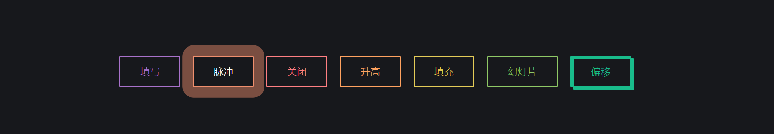
html代码
<div class="buttons"> <button class="fill">填写</button> <button class="pulse">脉冲</button> <button class="close">关闭</button> <button class="raise">升高</button> <button class="up">填充</button> <button class="slide">幻灯片</button> <button class="offset">偏移</button></div>
css样式
.fill:hover, .fill:focus { box-shadow: inset 0 0 0 2em var(--hover);}.pulse:hover, .pulse:focus { -webkit-animation: pulse 1s; animation: pulse 1s; box-shadow: 0 0 0 2em rgba(255, 255, 255, 0);}@-webkit-keyframes pulse { 0% { box-shadow: 0 0 0 0 var(--hover); }}@keyframes pulse { 0% { box-shadow: 0 0 0 0 var(--hover); }}.close:hover, .close:focus { box-shadow: inset -3.5em 0 0 0 var(--hover), inset 3.5em 0 0 0 var(--hover);}.raise:hover, .raise:focus { box-shadow: 0 0.5em 0.5em -0.4em var(--hover); -webkit-transform: translateY(-0.25em); transform: translateY(-0.25em);}.up:hover, .up:focus { box-shadow: inset 0 -3.25em 0 0 var(--hover);}.slide:hover, .slide:focus { box-shadow: inset 6.5em 0 0 0 var(--hover);}.offset { box-shadow: 0.3em 0.3em 0 0 var(--color), inset 0.3em 0.3em 0 0 var(--color);}.offset:hover, .offset:focus { box-shadow: 0 0 0 0 var(--hover), inset 6em 3.5em 0 0 var(--hover);}.fill { --color: #a972cb; --hover: #cb72aa;}.pulse { --color: #ef6eae; --hover: #ef8f6e;}.close { --color: #ff7f82; --hover: #ffdc7f;}.raise { --color: #ffa260; --hover: #e5ff60;}.up { --color: #e4cb58; --hover: #94e458;}.slide { --color: #8fc866; --hover: #66c887;}.offset { --color: #19bc8b; --hover: #1973bc;}button { color: var(--color); -webkit-transition: 0.25s; transition: 0.25s;}button:hover, button:focus { border-color: var(--hover); color: #fff;}body { color: #fff; background: #17181c; font: 300 1em 'Fira Sans', sans-serif; -webkit-box-pack: center; -ms-flex-pack: center; justify-content: center; -ms-flex-line-pack: center; align-content: center; -webkit-box-align: center; -ms-flex-align: center; align-items: center; text-align: center; min-height: 100vh; display: -webkit-box; display: -ms-flexbox; display: flex;}button { background: none; border: 2px solid; font: inherit; line-height: 1; margin: 0.5em; padding: 1em 2em;}h1 { font-weight: 400;}code { color: #e4cb58; font: inherit;}
效果图


 绝地灬酷狼
绝地灬酷狼 朱雀
朱雀 £神魔★判官ぃ


还没有评论,来说两句吧...