纯css实现进度条百分比效果
一个完整的进度条效果其实可以拆分一下
一段背景
一小段的静态的斜纹进度条
斜纹进度条用线性渐变 linear-gradient 类实现,原理很好理解,2个参数:
1、角度
2、关键点(包含2个参数,1是颜色,2是长度位置)

display: inline-block;width: 100px;height: 100px;background-image: linear-gradient(0, #f10 0px, #ddd 50px);
这是最基础的渐变,构造了一个100px*100px的正方形,渐变角度为0(从下到上),关键点A颜色#f10,开始长度为0px,关键B颜色#ddd,开始长度为50px,长度为 点A到点B的长度差(50px)的这一段 就是渐变区域,点B到末尾就是纯点B的颜色#ddd的区域,即上图的渐变其实有个隐藏的关键点C颜色#ddd,开始长度为100px,上图的线性渐变完整的写法是
background-image: linear-gradient(0, #f10 0px, #ddd 50px, #ddd 100px);

静态的斜纹进度条的样式是
linear-gradient(60deg, transparent 0, transparent 0.8rem, #4dafe2 0.8rem, #4dafe2 1.6rem, transparent 1.6rem, transparent 2.4rem, #4dafe2 2.4rem);
渐变角度为60度;
0~0.8rem是第一段渐变区域,由于2个关键点的颜色相同(transparent是透明的,即颜色由背景决定),所以这一段渐变区域 在忽略渐变角度的情况下 其实是纯色的的长度为0.8rem的长方形;
0.8rem~0.8rem是第二段渐变区域,由于2个关键点的长度位置相同,所以即便2个关键点的颜色不同,但是这一段渐变区域的长度为 2个关键点的长度位置的差值 即0,等于没有任何渐变效果;
0.8rem~1.6rem……同理。
那么就构造出了这么一段静态的进度条,我们只需要一个无限循环的动画不断控制background-position水平移动,就可以写出一个进度条的效果。

源码
<!doctype html><head><meta charset="UTF-8"><title>process</title><style>html {font-size: 62.5%;}.bg_fff {background-color: #fff;}.xui-wrapper {margin:0 auto;width:100%;max-width:750px;/*height:100vh;*/background-color:#efeff4;}.xui-myPromption-wrapper .xui-returnCommission .xui-process {position: relative;display: inline-block;vertical-align: middle;padding: 28px 0 12px;width: 76%;}.xui-myPromption-wrapper .xui-process .xui-icon-flag {position: absolute;top: 10px;left: 0;width: 12px;height: 18px;background-size: 11px;}.xui-myPromption-wrapper .xui-process .xui-process-static {width: 100%;height: 15px;border-radius: 10px;-webkit-box-shadow: 0 0 5px rgba(0, 198, 255,.6);box-shadow: 0 0 5px rgba(0, 198, 255,.6);background-color: rgba(0, 198, 255,.6);}.xui-myPromption-wrapper .xui-process .xui-process-active {position: absolute;top: 28px;left: 0;width: 0;height: 14px;border: 1px solid #4dafe2;border-radius: 10px;background-image: linear-gradient(60deg, transparent 0rem, transparent 0.8rem, #4dafe2 0.8rem, #4dafe2 1.6rem, transparent 1.6rem, transparent 2.4rem, #4dafe2 2.4rem);background-color: #008cd5;background-size: 20px 38px;-box-shadow: box-shadow: 1px 1px 5px rgba(0, 140, 213, .8);box-shadow: 1px 1px 5px rgba(0, 140, 213, .8);-webkit-animation: process 800ms infinite linear;animation: process 800ms infinite linear;}.xui-myPromption-wrapper .xui-process .xui-process-active:after {content: '';position: absolute;top: 0;left: 0;right: 0;bottom: 0;height: 100%;border-radius: 10px;background-image: linear-gradient(to bottom,rgba(0, 140, 213, .6), rgba(0, 140, 213, .6) 15%, transparent 60%, rgba(0, 140, 213, .6));}/* 动画 */@-webkit-keyframes process {0% { background-position: 0 0; }100% { background-position: 20px 0; }}@keyframes process {0% { background-position: 0 0; }100% { background-position: 20px 0; }}</style></head><body><div class="xui-wrapper xui-myPromption-wrapper"><div class="xui-mainContain pt10 bg_fff"><div class="xui-returnCommission"><div class="xui-process"><i id="icon-flag" class="xui-icon-flag"></i><div class="xui-process-static"></div><div id="process-bar" class="xui-process-active" style="width: 80%;"></div></div></div></div></div><script>(function (hasGet, totalGet) {var flag = document.getElementById('icon-flag'),processBar = document.getElementById('process-bar'),widthPercentage = Math.round(hasGet/totalGet*100);if (widthPercentage >= 100) {widthPercentage = 100;}flag.style.left = (widthPercentage-1) + '%';processBar.style.width = widthPercentage + '%';if (widthPercentage == 0) {processBar.style.borderStyle = 'none';}})(10, 20);</script></body></html>
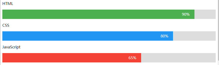
简洁版-演示
<h1>进度条</h1><p>HTML</p><div class="container"><div class="skills html">90%</div></div><p>CSS</p><div class="container"><div class="skills css">80%</div></div><p>JavaScript</p><div class="container"><div class="skills js">65%</div></div><p>PHP</p><div class="container"><div class="skills php">60%</div></div>* {box-sizing: border-box}.container {width: 100%;background-color: #ddd;}.skills {text-align: right;padding-right: 20px;line-height: 40px;color: white;}.html {width: 90%; background-color: #4CAF50;}.css {width: 80%; background-color: #2196F3;}.js {width: 65%; background-color: #f44336;}.php {width: 60%; background-color: #808080;}


 骑猪看日落
骑猪看日落 亦凉
亦凉 左手的ㄟ右手
 小灰灰
小灰灰 向右看齐
向右看齐 古城微笑少年丶
 超、凢脫俗
超、凢脫俗 分手后的思念是犯贱
 傷城~
傷城~


![策略游戏设计日记[一]](https://image.dandelioncloud.cn/images/20230521/716f837882684a618ed4464805321291.png "策略游戏设计日记[一]")


还没有评论,来说两句吧...