纯css实现粒子效果
前端开发whqet,csdn,王海庆,whqet,前端开发专家
好久没有更新的CSS3演武场系列,半年前搁浅的一篇文章赋予新年新气象闪亮登场了,研究一下利用css(sass)实现粒子效果,主要使用box-shadow生成粒子,利用css3 animation和translateZ实现动画。
-—————————————————————————————-
--我参加了博客之星评选,如果你喜欢我的博客,求投票,您的支持是我的动力之源,走起!
-————————————————————————————————————————————
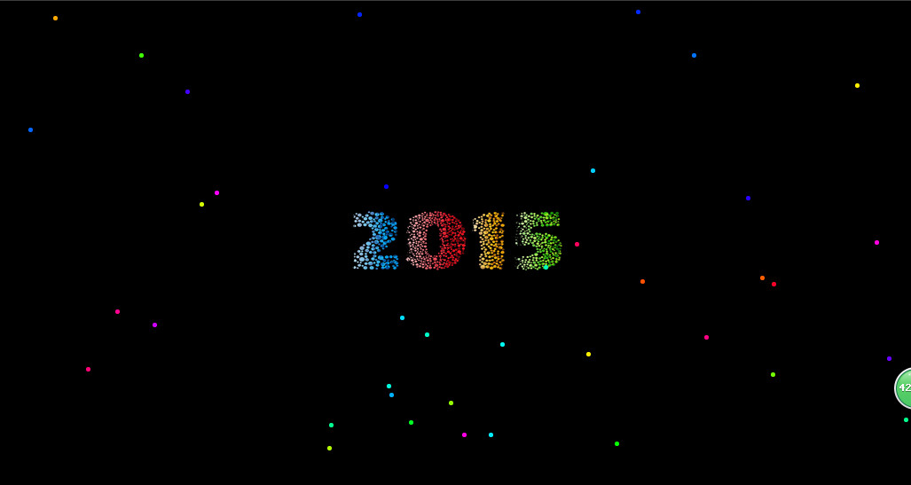
看效果先

思路解析
1.box-shadow生成粒子,赋予随机位置、随机颜色,利用sass的for循环和random()实现。
2.animation实现动画。
3.transform 3d实现深度动画,主要使用translateZ。
实现
下面我们分别来实现一下,源码我放在了codepen,请大家移步。
-———————-
-———————————————————-
在线研究点击这里,下载收藏点击这里。
-———————————————————-
-———————
1.html部分非常简单就是一个div。
<div class="stars"></div>
2.css部分是重点,我们首先设置全局的css,我们使用normallize和prefix free。然后对html和body作如下设置。
$stars: 100; // 粒子数$depth: 300; // 深度$speed: 1s; // 动画时间$width: 1500; // 宽$height: 960; // 高html, body {height: 100%;overflow: hidden;}body {perspective: 340px;background:#000 url(https://img-my.csdn.net/uploads/201501/02/1420174857_3649.png) center center no-repeat;background-size:28% 30%;}
对于.stars,我们设置大小、位置,宽、高各位5px,位置居中,圆角边框。
.stars {position: absolute;top: 50%;left: 50%;width:5px;height:5px;border-radius:100%;}
然后我们使用box-shadow生成粒子。box-shadow一个很好玩的特性,生成效果如下。
.stars {position: absolute;top: 50%;left: 50%;width:5px;height:5px;border-radius:100%;/*box-shadow生成粒子*/$box-shadow: ();@for $i from 0 through $stars {$box-shadow: $box-shadow, (random($width)-$width/2 + px) (random($height)-$height/2 + px) adjust-hue(#ff0000, random(360));}box-shadow: $box-shadow;}
然后这个数量有点少,同时层次感不足,我们利用:before和:after伪对象搞定这些事情。
.stars {position: absolute;top: 50%;left: 50%;width:5px;height:5px;border-radius:100%;$box-shadow: ();@for $i from 0 through $stars {$box-shadow: $box-shadow, (random($width)-$width/2 + px) (random($height)-$height/2 + px) adjust-hue(#ff0000, random(360));}box-shadow: $box-shadow;/*伪对象更多粒子、更多层次*/&:before, &:after {content: "";position: absolute;width: inherit;height: inherit;box-shadow: inherit;}&:before {transform: translateZ(-$depth + px);opacity: .3;}&:after {transform: translateZ(-$depth * 2 + px);opacity: .1;}}
添加粒子和深度之后效果如下图所示。

然后添加动画。
.stars {position: absolute;top: 50%;left: 50%;width:5px;height:5px;border-radius:100%;/*box-shadow生成粒子*/$box-shadow: ();@for $i from 0 through $stars {$box-shadow: $box-shadow, (random($width)-$width/2 + px) (random($height)-$height/2 + px) adjust-hue(#ff0000, random(360));}box-shadow: $box-shadow;/* 添加动画 */animation: fly $speed linear infinite;transform-style:preserve-3d;/* 伪对象更多粒子、更多层次 */&:before, &:after {content: "";position: absolute;width: inherit;height: inherit;box-shadow: inherit;}&:before {transform: translateZ(-$depth + px);opacity: .3;}&:after {transform: translateZ(-$depth * 2 + px);opacity: .1;}}@keyframes fly {from {transform: translateZ(0px);opacity:.1;}to {transform: translateZ($depth + px);opacity:0.8;}}
然后,就可以欣赏效果了。最后给大家附带完整的css源码。
$stars: 100; // 粒子数$depth: 300; // 深度$speed: 1s; // 动画时间$width: 1500; // 宽$height: 960; // 高html, body {height: 100%;overflow: hidden;}body {perspective: 340px;background:#000 url(https://img-my.csdn.net/uploads/201501/02/1420174857_3649.png) center center no-repeat;background-size:28% 30%;}.stars {position: absolute;top: 50%;left: 50%;width:5px;height:5px;border-radius:100%;$box-shadow: ();@for $i from 0 through $stars {$box-shadow: $box-shadow, (random($width)-$width/2 + px) (random($height)-$height/2 + px) adjust-hue(#ff0000, random(360));}box-shadow: $box-shadow;/*animation: fly $speed linear infinite;transform-style:preserve-3d;*/&:before, &:after {content: "";position: absolute;width: inherit;height: inherit;box-shadow: inherit;}&:before {transform: translateZ(-$depth + px);opacity: .3;}&:after {transform: translateZ(-$depth * 2 + px);opacity: .1;}}@keyframes fly {from {transform: translateZ(0px);opacity:.1;}to {transform: translateZ($depth + px);opacity:0.8;}}
感谢您耐心读完,如果对您有帮助,请支持我!
-————————————————————————————-
前端开发whqet,关注web前端开发,分享相关资源,欢迎点赞,欢迎拍砖。
-————————————————————————————————————————————————————


 ゞ 浴缸里的玫瑰
 ╰半橙微兮°
 你的名字
你的名字 小灰灰
小灰灰 野性酷女
野性酷女 柔情只为你懂


")


还没有评论,来说两句吧...