Vue封装组件-按钮-LjButton
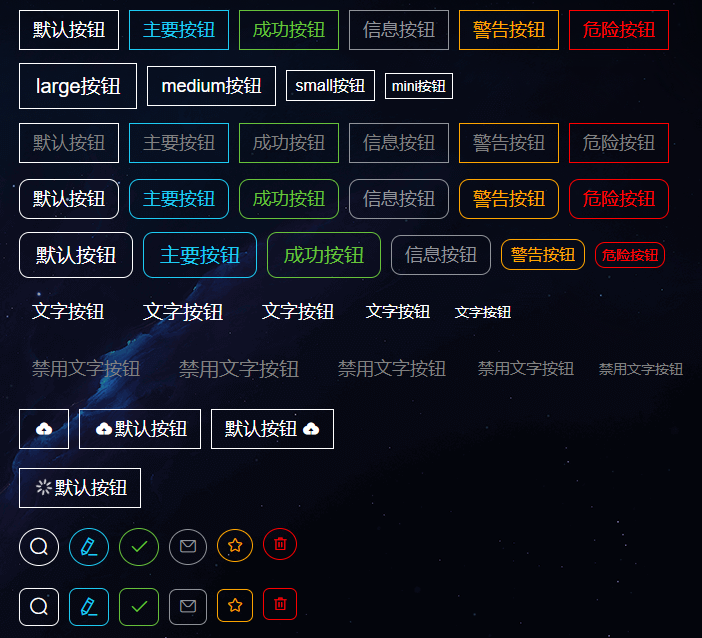
使用:
<!--menu5--><template><div class="menu5"><div><LjButton @click="dialogVisible = true">打开弹出框</LjButton></div><el-dialogtitle="提示":visible.sync="dialogVisible"width="30%":modal-append-to-body="false"><span>这是一段信息</span><span slot="footer" class="dialog-footer"><LjButtonstyle="margin: 0 10px"type="danger"@click="dialogVisible = false">取 消</LjButton><LjButton type="primary" @click="dialogVisible = false">确 定</LjButton></span></el-dialog><div><p><LjButton>默认按钮</LjButton><LjButton type="primary">主要按钮</LjButton><LjButton type="success">成功按钮</LjButton><LjButton type="info">信息按钮</LjButton><LjButton type="warning">警告按钮</LjButton><LjButton type="danger">危险按钮</LjButton></p><p><LjButton size="large">large按钮</LjButton><LjButton size="medium">medium按钮</LjButton><LjButton size="small">small按钮</LjButton><LjButton size="mini">mini按钮</LjButton></p><p><LjButton type="default" disabled>默认按钮</LjButton><LjButton type="primary" disabled>主要按钮</LjButton><LjButton type="success" disabled>成功按钮</LjButton><LjButton type="info" disabled>信息按钮</LjButton><LjButton type="warning" disabled>警告按钮</LjButton><LjButton type="danger" disabled>危险按钮</LjButton></p><p><LjButton round>默认按钮</LjButton><LjButton type="primary" round>主要按钮</LjButton><LjButton type="success" round>成功按钮</LjButton><LjButton type="info" round>信息按钮</LjButton><LjButton type="warning" round>警告按钮</LjButton><LjButton type="danger" round>危险按钮</LjButton></p><p><LjButton round size="large">默认按钮</LjButton><LjButton type="primary" round size="large">主要按钮</LjButton><LjButton type="success" round size="large">成功按钮</LjButton><LjButton type="info" round size="medium">信息按钮</LjButton><LjButton type="warning" round size="small">警告按钮</LjButton><LjButton type="danger" round size="mini">危险按钮</LjButton></p><p><LjButton type="text">文字按钮</LjButton><LjButton type="text" size="large">文字按钮</LjButton><LjButton type="text" size="medium">文字按钮</LjButton><LjButton type="text" size="small">文字按钮</LjButton><LjButton type="text" size="mini">文字按钮</LjButton></p><p><LjButton type="text" disabled>禁用文字按钮</LjButton><LjButton type="text" size="large" disabled>禁用文字按钮</LjButton><LjButton type="text" size="medium" disabled>禁用文字按钮</LjButton><LjButton type="text" size="small" disabled>禁用文字按钮</LjButton><LjButton type="text" size="mini" disabled>禁用文字按钮</LjButton></p><p><LjButton icon="el-icon-upload"></LjButton><LjButton icon="el-icon-upload">默认按钮</LjButton><LjButton>默认按钮<i class="el-icon-upload el-icon--right"></i></LjButton></p><p><LjButton :loading="true">默认按钮</LjButton></p><p><LjButton circle size="large" icon="el-icon-search"></LjButton><LjButtontype="primary"circlesize="large"icon="el-icon-edit"></LjButton><LjButtontype="success"circlesize="large"icon="el-icon-check"></LjButton><LjButtontype="info"circlesize="medium"icon="el-icon-message"></LjButton><LjButtontype="warning"circlesize="small"icon="el-icon-star-off"></LjButton><LjButtontype="danger"circlesize="mini"icon="el-icon-delete"></LjButton></p><p><LjButton square size="large" icon="el-icon-search"></LjButton><LjButtontype="primary"squaresize="large"icon="el-icon-edit"></LjButton><LjButtontype="success"squaresize="large"icon="el-icon-check"></LjButton><LjButtontype="info"squaresize="medium"icon="el-icon-message"></LjButton><LjButtontype="warning"squaresize="small"icon="el-icon-star-off"></LjButton><LjButtontype="danger"squaresize="mini"icon="el-icon-delete"></LjButton></p></div></div></template><script>import LjButton from "@/components/LjButton/index.vue";import LjDialog from "@/components/LjDialog/index.vue";export default {name: "menu5",components: { LjButton, LjDialog },props: {},data() {return {dialogVisible: false,};},computed: {},created() {},mounted() {},filters: {},methods: {},watch: {},};</script><style lang="scss" scoped>.menu5 {display: grid;grid-template-columns: 1fr 1fr;p {margin: 40px 0;display: flex;gap: 10px;}}</style>
LjButton.vue:
<!--LjButton--><template><div class="LjButton"><span:class="[typeClass,sizeClass,roundClass,disabledClass,circleClass,squareClass,]"@click="clickButton()"><span v-if="loading" style="padding: 2px"><i class="el-icon-loading"></i></span><span v-else-if="icon" style="padding: 2px"><i :class="icon" /></span><slot></slot></span></div></template><script>export default {name: "LjButton",components: {},props: {type: {type: String,default: "",},size: {type: String,default: "",},disabled: {type: Boolean,default: false,},round: {type: Boolean,default: false,},icon: {type: String,default: "",},loading: {type: Boolean,default: false,},circle: {type: Boolean,default: false,},square: {type: Boolean,default: false,},},data() {return {};},computed: {typeClass() {return {"LjButton-default": this.type === "" || this.type === "default","LjButton-primary": this.type === "primary","LjButton-warning": this.type === "warning","LjButton-success": this.type === "success","LjButton-info": this.type === "info","LjButton-danger": this.type === "danger","LjButton-text": this.type === "text",};},sizeClass() {return {"LjButton-size-large": this.size === "large","LjButton-size-medium": this.size === "" || this.size === "medium","LjButton-size-small": this.size === "small","LjButton-size-mini": this.size === "mini",};},disabledClass() {if (this.disabled) {return { "LjButton-disabled": true };}},roundClass() {if (this.round) {return { "LjButton-round": true };}},circleClass() {if (this.circle) {return { "LjButton-circle": true };}},squareClass() {if (this.square) {return { "LjButton-square": true };}},},created() {},mounted() {},filters: {},methods: {clickButton() {this.$emit("click"); //没有这个的话,组件在使用click点击事件时需要加上native,即@click.native="xxx"},},watch: {},};</script><style lang="scss" scoped>$color-default: #1dcbf3;$color-primary: #1dcbf3;$color-warning: orange; //#f56c6c$color-success: #67c23a; //#f56c6c$color-info: #909399;$color-danger: red;$bgColor-primary: rgba(0, 183, 255, 0.3);$bgColor-warning: rgba(255, 166, 0, 0.3);$bgColor-success: rgba(103, 194, 58, 0.3); //#f56c6c$bgColor-info: rgba(144, 147, 153, 0.3); //#f56c6c$bgColor-danger: rgba(255, 0, 0, 0.3); //#f56c6c.LjButton {display: inline-block;caret-color: transparent;.LjButton-default {border: 1px solid white;color: white;&:hover {cursor: pointer;color: $color-default;border: 1px solid $color-default;}}.LjButton-primary {border: 1px solid $color-primary;color: $color-primary;&:hover {cursor: pointer;background-color: $bgColor-primary;}}.LjButton-warning {border: 1px solid $color-warning;color: $color-warning;&:hover {cursor: pointer;background-color: $bgColor-warning;}}.LjButton-success {border: 1px solid $color-success;color: $color-success;&:hover {cursor: pointer;background-color: $bgColor-success;}}.LjButton-info {border: 1px solid $color-info;color: $color-info;&:hover {cursor: pointer;background-color: $bgColor-info;}}.LjButton-danger {border: 1px solid $color-danger;color: $color-danger;&:hover {cursor: pointer;background-color: $bgColor-danger;}}.LjButton-text {color: white;&:hover {cursor: pointer;color: $color-default;}}//size.LjButton-size-large {font-size: 20px;padding: 11px 16px;}.LjButton-size-medium {font-size: 18px;padding: 9px 13px;}.LjButton-size-small {font-size: 16px;padding: 6px 9px;}.LjButton-size-mini {font-size: 14px;padding: 4px 6px;}//disabled.LjButton-disabled {color: gray;&:hover {cursor: not-allowed;}}//round.LjButton-round {border-radius: 10px;}//circle.LjButton-circle {border-radius: 50%;padding: 7px;}//square.LjButton-square {border-radius: 20%;padding: 7px;}}</style>


 爱被打了一巴掌
 分手后的思念是犯贱
 快来打我*
快来打我* 刺骨的言语ヽ痛彻心扉
 淩亂°似流年
 你的名字
你的名字

- 找指定长度的目标子串+哈希")
")


还没有评论,来说两句吧...