纯CSS实现图像鼠标悬停效果
前端开发whqet,csdn,王海庆,whqet,前端开发专家
今天来看一组纯CSS实现的鼠标悬停效果,在线研究代码点效果一、效果二、效果三,下载收藏点这里,效果预览点这里。
效果1
效果1的html文件
<div class="pic"><img src="pic.jpg" alt=""><span>这里是个标题呀</span></div>
css文件中我们主要实现定位和hover动画。
/* 图片盒子的样式,宽高、边框、阴影、位置、鼠标样式、溢出 */.pic{width: 500px;height: 500px;border: 10px solid #333;box-shadow: 0 0 10px rgba(0,0,0,.6);margin: 50px auto;position: relative;overflow: hidden;cursor: pointer;}/* 图片标题的样式,宽高、背景色、水平垂直居中、定位,透明度 */.pic span{position: absolute;left: 0;bottom: 0;width: 500px;height: 50px;background: rgba(0,0,0,.5);color: #fff;font-size: 24px;line-height: 50px;text-align: center;opacity: 0;}/* 给需要动画的元素加过渡属性 */.pic img,.pic span{transition: all .5s;}/* hover之后透明动画 */.pic:hover span{opacity: 1;}/* hover之后图片放大的效果 */.pic:hover img{transform: scale(2);}
效果2
下面看效果2,上下滑动打开的实现过程。首先看html文件,我们需要两个图片元素,一个显示上半部分,一个显示下半部分。
<div class="pic"><img class="top" src="pic.jpg" alt="top"><img class="bottom" src="pic.jpg" alt="bottom"><span>OK,You can see it.</span></div>
css文件如下,我们把实现原理写到注释里,就不一一解释了。
/* 图像盒子的样式设置,宽高、边框、阴影、溢出、位置 */div.pic{width: 500px;height: 500px;cursor: pointer;margin: 50px auto;position: relative;overflow: hidden;border: 10px solid #333;box-shadow: 0 0 10px rgba(0,0,0,.8);}/* 上下两半部分的统一设置,绝对定位和过渡 */div.pic img{position: absolute;left: 0;transition: all 1s;}/* 上半部分图像的裁剪和定位 */div.pic img.top{top: 0;clip: rect(0px,500px,250px,0px);}/* 下半部分图像的裁剪和定位 */div.pic img.bottom{bottom: 0;clip: rect(250px,500px,500px,0px);}/* hover之后图像的定位改变 */div.pic:hover img.top{top: -50px;}div.pic:hover img.bottom{bottom: -50px;}/* 图像标题的样式设置,文字颜色、水平居中、垂直居中 */div.pic span{display: inline-block;;width: 100%;text-align: center;line-height: 500px;font-size: 24px;}
重点解释下CSS Clip的裁剪原理。
clip: rect(<top>, <right>, <bottom>, <left>);
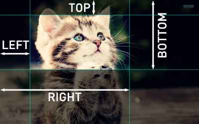
这里的top、right、bottom、left指的是裁剪之后的矩形的上右下左四个边到原始边的距离,如下图所示
大家可以看看张鑫旭大牛的《CSS clip:rect矩形剪裁功能及一些应用介绍》了解详情,或者通过在线体会案例体验裁剪效果。
大家也可以利用Codrops上的《Expanding Overlay Effect》学习clip属性的超酷应用。
效果3
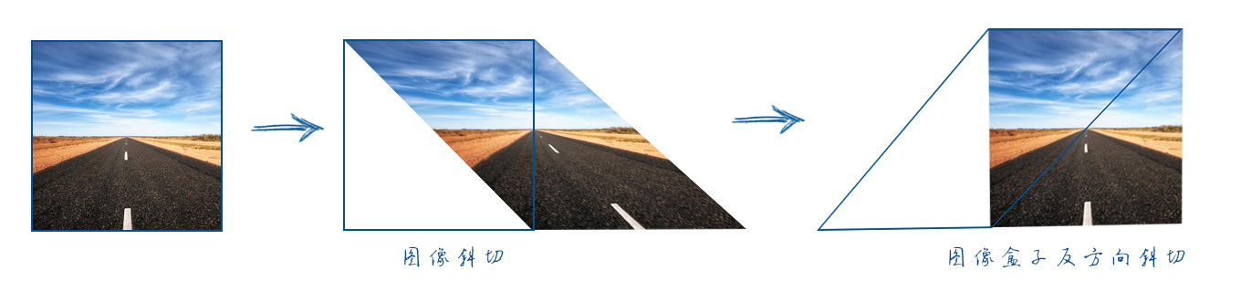
效果3的难点在于三角线图像的实现,我们这里主要利用skew()实现。html文件是这样的,我们需要分别在两个图像上加容器,然后分别对图像容器和图像设置相反方向的斜切。
<div class="pic"><div class="top"><img src="http://gx.zptc.cn/whqet/img/road.jpg"></div><div class="bottom"><img class="bottom" src="http://gx.zptc.cn/whqet/img/road.jpg"></div><span>OK,You can see it.</span></div>
效果css文件
/* 图像盒子的样式,与前两个效果无异 */.pic {width: 500px;height: 500px;overflow: hidden;cursor: pointer;border: 10px solid #333;box-shadow: 0 0 10px rgba(0, 0, 0, .8);margin: 50px auto;position: relative;}/* 两个图像的小容器的定位、斜切、溢出,因为图像宽高相同,所以斜切45度 */.pic .top, .pic .bottom {width: 500px;height: 500px;overflow: hidden;position: absolute;transform: skew(-45deg);}/* 上下两个图像小容器分别设置不同的位置,变换原点 */.pic .top {left: 0;top: 0;transform-origin: 100% 0;transition:all 1s, transform 0s;}.pic .bottom {right: 0;bottom: 0;transform-origin: 0 100%;transition:all 1s, transform 0s;}/* 上下两个图像向相反方向斜切 */.pic .top img, .pic .bottom img {width: 100%;height: 100%;transform-origin: inherit;transform: skew(45deg);}/* hover之后图像小容器的变化 */.pic:hover .top {left: -20px;top: -20px;}.pic:hover .bottom {right: -20px;bottom: -20px;}/* 图像标题的设置 */.pic span {transform: rotate(-45deg);transform-origin: 0 100%;position: absolute;font-size:20px;bottom:-.5em;opacity: 0;transition: all 1s ease-in .2s;}.pic:hover span {opacity: 1;text-indent: 15em;}
实现原理如下图所示,蓝色线框代表图像盒子.top,我们分别给图像和图像盒子不同方向相同角度的斜切实现效果,只有线框内的图像显示。
这样我们可以实现图像的三角形裁切效果,根据这样的原理大家可以尝试不同形状的实现。欢迎大家提供不同的实现思路。
That’s all. 迎接鼓励,欢迎拍砖。
-———————————————————————————————
前端开发whqet,关注web前端开发技术,分享网页相关资源。
-———————————————————————————————


 柔情只为你懂
 小鱼儿
小鱼儿 迷南。
迷南。 系统管理员
系统管理员 淩亂°似流年
 分手后的思念是犯贱
 男娘i
男娘i 港控/mmm°


还没有评论,来说两句吧...