CSS鼠标悬停
在学习中遇到许多好看的样式,虽然只是用HTML+CSS简单的实现,仅作为我的学习笔记和同爱好学习者的分享:
- 先看效果
" class="reference-link">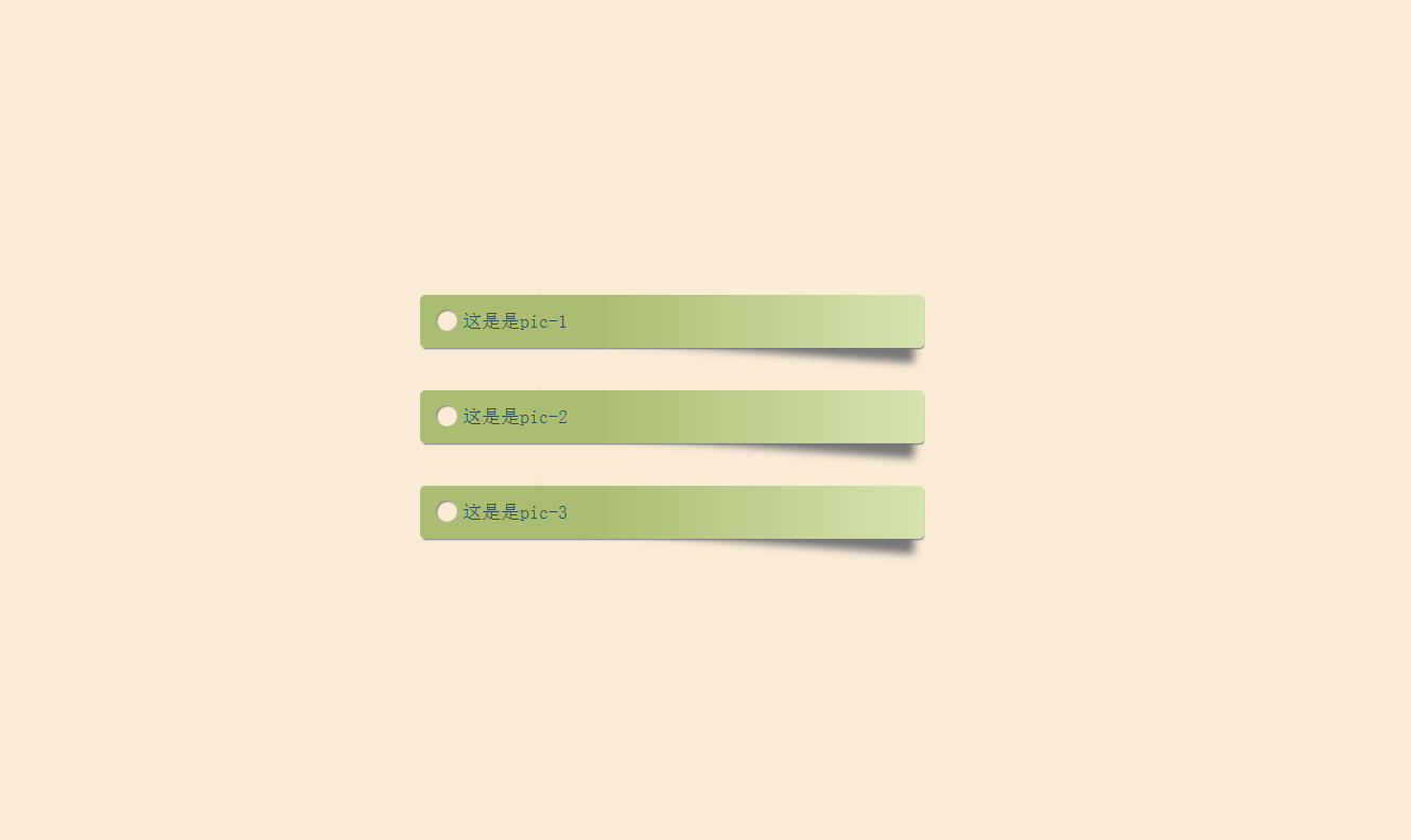
HTML部分
html:
<div class="box shadow">这是是pic-1<div class="circle"></div></div><div class="box shadow">这是是pic-2<div class="circle"></div></div><div class="box shadow">这是是pic-3<div class="circle"></div></div>
CSS样式
css:
<style type="text/css">html { box-sizing: border-box; font: 18px PT Mono; background: antiquewhite; }*,*::before,*::after { box-sizing: inherit; }body { display: flex; align-items: center; justify-content: center; flex-direction: column; width: 100%; height: 100vh; }.box { width: 25%; min-width: 250px; display: block; height: 50px; position: relative; border-radius: 5px; background: linear-gradient(to right, #abbd73 35%, #d6e2ad 100%); margin-bottom: 40px; padding: 15px 25px 0 40px; color: darkslategray; box-shadow: 1px 2px 1px -1px #777; transition: background 200ms ease-in-out; }.shadow { position: relative; }.shadow:before { z-index: -1; position: absolute; content: ""; bottom: 13px; right: 7px; width: 75%; top: 0; box-shadow: 0 15px 10px #777; -webkit-transform: rotate(4deg); transform: rotate(4deg); transition: all 150ms ease-in-out; }.box:hover { background: linear-gradient(to right, #abbd73 0%, #abbd73 100%); }.shadow:hover::before { -webkit-transform: rotate(0deg); transform: rotate(0deg); bottom: 20px; z-index: -10; }.circle { position: absolute; top: 14px; left: 15px; border-radius: 50%; box-shadow: inset 1px 1px 1px 0px rgba(0, 0, 0, 0.5), inset 0 0 0 25px antiquewhite; width: 20px; height: 20px; display: inline-block; }</style>
内容虽然简单,但样式还是挺实用的。
可以配合fullPage.js的布局实现好看的界面效果哟~


 迷南。
迷南。 桃扇骨
桃扇骨 系统管理员
系统管理员 淩亂°似流年
 分手后的思念是犯贱
 不念不忘少年蓝@
 港控/mmm°


还没有评论,来说两句吧...