ECharts 折线图改变title lenendX轴Y轴字体颜色,大小改变(vue引用)
改变背景,字体,折线颜色,x,y轴颜色,title字体颜色,lenend字体颜色,y轴添加单位后的效果图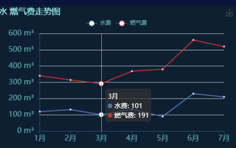
原图
代码
js
mounted(){this.powerChart = this.$echarts.init(document.getElementById("Echart"));this.electricChart = this.$echarts.init(document.getElementById("Pchart"));// 调用方法this.drawChart();},// 折线图methods:{drawChart(){let option = {// 背景图颜色backgroundColor:"#0E1F31",title: {text: '水 燃气费走势图',textStyle: {fontWeight: 'normal',color: '#A3FFFC' //标题颜色},},tooltip: {trigger: 'axis'},legend: {data:['水费','燃气费'],top:'9%',textStyle: {fontWeight: 'normal',color: '#62B4BB' //legend颜色},},grid: {// top:'1%',left: '5%',right: '5%',bottom: '3%',containLabel: true},toolbox: {feature: {saveAsImage: {}}},xAxis: [{type: 'category',boundaryGap: false,data: ['1月','2月','3月','4月','5月','6月','7月'],// 改变x轴颜色axisLine:{lineStyle:{color:'#2A5D75',}},// 改变x轴字体颜色和大小axisLabel: {textStyle: {color: '#62B4BB',fontSize:'16'},},}],yAxis: [{type: 'value',// 改变y轴颜色axisLine:{lineStyle:{color:'#2A5D75',}},// 改变y轴字体颜色和大小axisLabel: {formatter: '{value} m³ ', // 给y轴添加单位textStyle: {color: '#62B4BB',fontSize:'16',},},}],series: [{name:'水费',type:'line',stack: '总量',data:[120, 132, 101, 134, 90, 230, 210],itemStyle:{normal:{color:'#4e76b5' // 给折线添加颜色},},},{name:'燃气费',type:'line',stack: '总量',data:[220, 182, 191, 234, 290, 330, 310]}]};//展示图this.electricChart.setOption(option_power);}}
html
<template><div style="height: 100%;"><div id="Echart" class="Echar" :style="{width: '100%', height: '30%'}"></div></div></template>


还没有评论,来说两句吧...