表单组件
button按钮
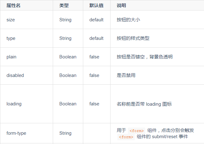
size有效值
- default 默认大小
- mini 小尺寸
type有效值
- primary 微信小程序为绿色,App、H5、百度小程序、支付宝小程序为蓝色,字节跳动小程序为红色,QQ小程序为浅蓝色
- default 白色
- warn 红色
form-type 有效值
- submit 提交表单
- reset 重置表单
效果示例
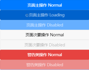
<button type="primary">页面主操作 Normal</button><button type="primary" loading="true">页面主操作 Loading</button> //名称前带 loading 图标<button type="primary" disabled="true">页面主操作 Disabled</button> //禁用<button type="default">页面次要操作 Normal</button> //白色<button type="default" disabled="true">页面次要操作 Disabled</button> //白色禁用<button type="warn">警告类操作 Normal</button> //红色警告<button type="warn" disabled="true">警告类操作 Disabled</button> //红色禁用
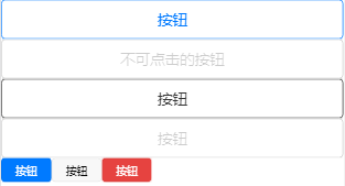
<button type="primary" plain="true">按钮</button> //镂空,背景色透明<button type="primary" disabled="true" plain="true">不可点击的按钮</button//禁用,透明<button type="default" plain="true">按钮</button> //白色,透明<button type="default" disabled="true" plain="true">按钮</button> //白色,禁用,透明<button type="primary" size="mini">按钮</button> //小尺寸<button type="default" size="mini">按钮</button> //白色,小尺寸<button type="warn" size="mini">按钮</button> //红色,小尺寸
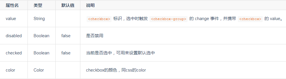
checkbox(多选项目)
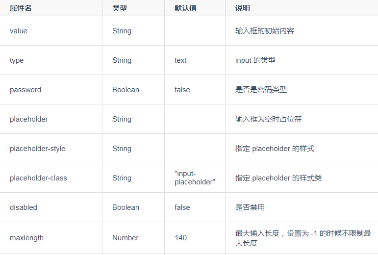
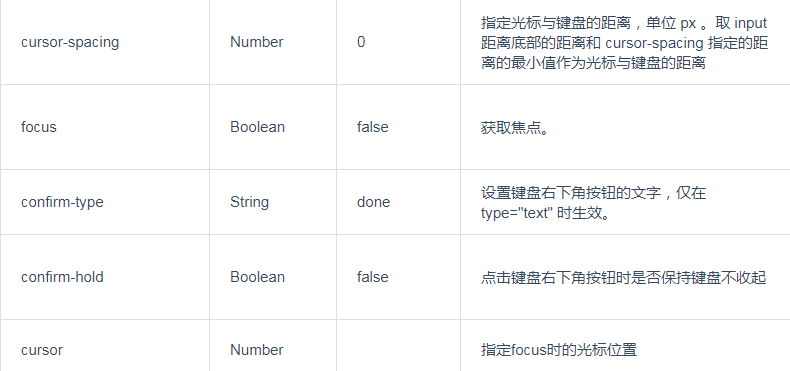
input(输入框)
注意:
- input 事件处理函数可以直接 return 一个字符串,将替换输入框的内容。仅微信小程序支持。
- input 事件处理函数内实时修改当前值不生效,可以延迟设置,例如:setTimeout(() => { this.value = 100 }, 0)。
- input 组件上有默认的 min-height 样式,如果 min-height 的值大于 height 的值那么 height样式无效。
type 有效值
- text 文本输入键盘
- number 数字输入键盘 (注意iOS的vue页面弹出的数字键盘并非9宫格方式)
- idcard 身份证输入键盘 (微信、支付宝、百度、QQ小程序)
- digit 带小数点的数字键盘 (App的nvue页面、微信、支付宝、百度、头条、QQ小程序)
注意:
1.小程序平台,number 类型只支持输入整型数字。微信开发者工具上体现不出效果,请使用真机预览。
- 如果需要在小程序平台输入浮点型数字,请使用 digit 类型。
- input组件若不想弹出软键盘,可设置为disable
confirm-type 有效值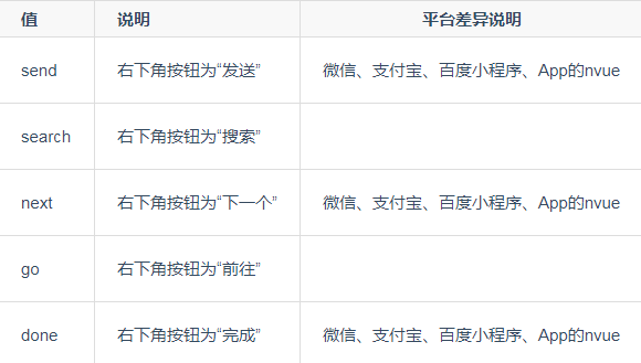
注意:
1.App平台的nvue页面,如果是uni-app编译模式,直接使用此属性设置即可生效。如果是weex编译模式,需通过weex的api设置,weex相关文档参考
2.App平台的vue页面不支持控制键盘右下角为“发送”,涉及聊天的建议使用nvue。 App平台iOS端软键盘上方横条去除方案
picker(从底部弹起的滚动选择器)
支持五中选择器:
- 普通选择器
- 多列选择器
- 时间选择器
- 日期选择器
- 省市区选择器
通过mode来区分,默认是普通选择器: mode = selector
时间选择器
mode = time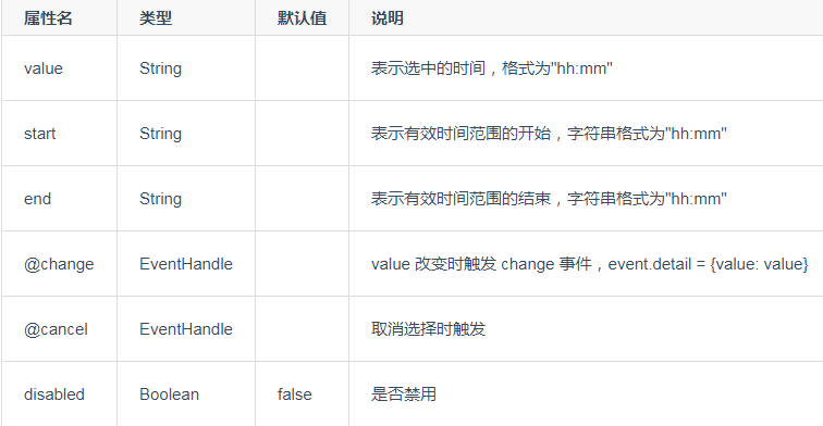
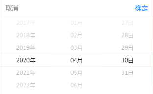
日期选择器
mode = date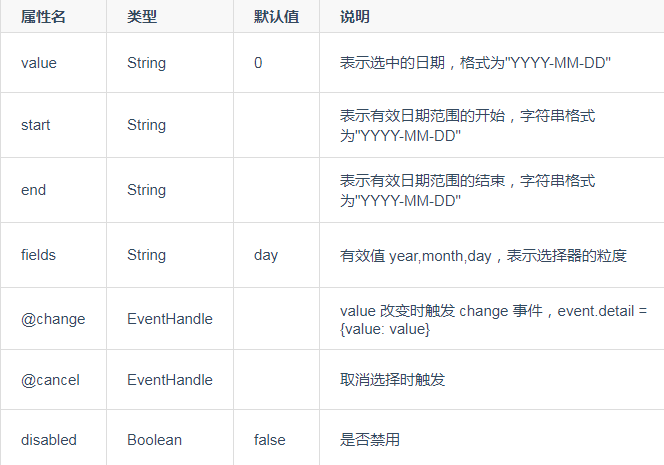
省市区选择器
mode = region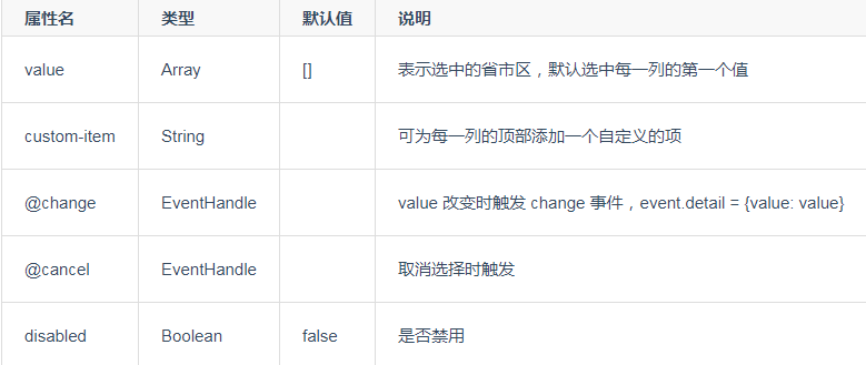
效果实现步骤
template部分:
<view class="uni-title uni-common-pl" style="background:gray ;">地区选择器</view><view class="uni-list"><view class="uni-list-cell" style="display: flex;"><view class="uni-list-cell-left" style="margin-right:60rpx">当前选择</view><view class="uni-list-cell-db"><picker @change="bindPickerChange" :value="index" :range="array"><view class="uni-input">{ { array[index]}}</view></picker></view></view></view><view class="uni-title uni-common-pl" style="background:gray ;">时间选择器</view><view class="uni-list"><view class="uni-list-cell" style="display: flex;"><view class="uni-list-cell-left" style="margin-right:60rpx">当前选择</view><view class="uni-list-cell-db"><picker mode="time" :value="time" start="09:01" end="21:01" @change="bindTimeChange"><view class="uni-input">{ { time}}</view></picker></view></view></view><view class="uni-title uni-common-pl" style="background:gray ;">日期选择器</view><view class="uni-list"><view class="uni-list-cell" style="display: flex;"><view class="uni-list-cell-left" style="margin-right:60rpx">当前选择</view><view class="uni-list-cell-db"><picker mode="date" :value="date" :start="startDate" :end="endDate" @change="bindDateChange"><view class="uni-input">{ { date}}</view></picker></view></view></view>
在data里添加:
const currentDate = this.getDate({format: true})
return里添加:
title: 'picker',array: ['中国', '美国', '巴西', '日本'],index: 0,date: currentDate,time: '12:01'
data外添加:
computed: {startDate() {return this.getDate('start');},endDate() {return this.getDate('end');}},
methods内添加:
bindPickerChange: function(e) {console.log('picker发送选择改变,携带值为', e.target.value)this.index = e.target.value},bindDateChange: function(e) {this.date = e.target.value},bindTimeChange: function(e) {this.time = e.target.value},getDate(type) {const date = new Date();let year = date.getFullYear(); //获取年份let month = date.getMonth() + 1; //获取月份let day = date.getDate(); //获取天数if (type === 'start') {year = year - 60;} else if (type === 'end') {year = year + 2;}month = month > 9 ? month : '0' + month;;day = day > 9 ? day : '0' + day;return `${ year}-${ month}-${ day}`;}
效果图如下: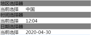


 深碍√TFBOYSˉ_
 朱雀
朱雀 今天药忘吃喽~
 刺骨的言语ヽ痛彻心扉
 左手的ㄟ右手
 分手后的思念是犯贱
 爱被打了一巴掌


还没有评论,来说两句吧...