仿支付宝我的银行卡动态切换效果
效果图: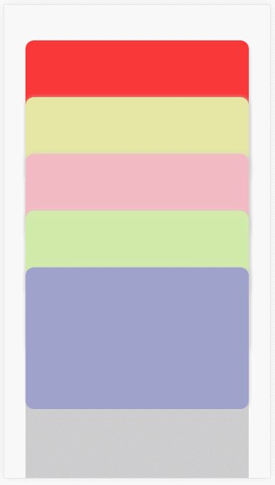
HTML代码,css写的有点冗余,下面有vue版本的用到了sass
<!DOCTYPE html><html lang="en"><head><meta charset="UTF-8"><meta name="viewport" content="width=device-width, initial-scale=1.0"><title>仿支付宝我的银行卡动态切换效果</title></head><style> * { margin: 0; padding: 0; } html, body { width: 100%; height: 100%; overflow: hidden; } .card-box { position: relative; top: 0; margin-top: 50px; transition: all linear .2s; } .card-list { position: absolute; left: 0; width: 100%; border-radius: 12px; padding: 0 30px; box-sizing: border-box; transition: all linear .2s; } .title { height: 200px; border-radius: 12px; box-shadow: 1px 1px 12px #ccc; } .content { height: 280px; background: #cdcdcd; } .card-list:nth-child(1) .title { background: rgb(250, 56, 56); } .card-list:nth-child(2) .title { background: rgb(230, 230, 165); } .card-list:nth-child(3) .title { background: rgb(243, 187, 196); } .card-list:nth-child(4) .title { background: rgb(209, 235, 170); } .card-list:nth-child(5) .title { background: rgb(159, 163, 204); } .card-list:nth-child(1) { top: 0; z-index: 1; } .card-list:nth-child(2) { top: 80px; z-index: 2 } .card-list:nth-child(3) { top: 160px; z-index: 3; } .card-list:nth-child(4) { top: 240px; z-index: 4; } .card-list:nth-child(5) { top: 320px; z-index: 5; } .card-list.up { top: -400px; transition: top linear .2s; } .card-box.down { top: 400px; transition: top linear .2s; } </style><body><div class="card-box" id="app" :class="{down:selectKey !== null}"><div class="card-list" v-for="(item,index) in 5" :key="index" :class="{up:selectKey == index}"><div class="title" @click="selListItem(index)"></div><div class="content"></div></div></div></body><script src="https://cdn.jsdelivr.net/npm/vue@2.6.11"></script><script> var app = new Vue({ el: "#app", data: { selectKey: null }, methods: { selListItem(index) { //当显示其中一个时,点击另一个,整体闭合 if (this.selectKey == null) { this.selectKey = index; } else { this.selectKey = null; } //当显示其中一个时,点击那个显示那个 /* if (index == this.selectKey) { this.selectKey = null; } else { this.selectKey = index; }*/ } } }) </script></html><template><div class="wallet"><div class="card-box" :class="{ 'down':selectKey !== null}"><div class="card-list" v-for="(item,index) in 5" :key="index" :class="{ 'up':selectKey == index}" @click="selListItem(index)"><div class="title"></div><div class="content"></div></div></div></div></template><script> export default { data() { return { selectKey: null } }, methods: { selListItem(index) { //当显示其中一个时,点击另一个,整体闭合 if (this.selectKey == null) { this.selectKey = index; } else { this.selectKey = null; } //当显示其中一个时,点击那个显示那个 /* if (index == this.selectKey) { this.selectKey = null; } else { this.selectKey = index; }*/ } } } </script><style lang='scss' scoped> $liColor:#f5ad1b,#5f89ce,#94bf45,#da8ec5,#78bfc2,#bec278; $card:150px; $content:280px; .wallet{ width: 100%; height: 100%; box-sizing: border-box; padding-top:88px; position: absolute; top:0; bottom: 0; overflow: hidden; } .card-box { position: relative; top: 0; transition: all linear .2s; width: 100%; } .card-list { position: absolute; left: 0; width: 100%; border-radius: 12px; padding: 0 20px; box-sizing: border-box; } .title { height: $card; border-radius: 12px; box-shadow: 1px 1px 12px #ccc; } .content { height: $content; background: #cdcdcd; display: none; } @each $c in $liColor{ $i:index($liColor,$c); .card-list:nth-child(#{ $i}) { top:130px* ($i - 1); z-index: $i; transition: top linear .2s; } .card-list:nth-child(#{ $i}) .title { background: $c; } } .card-box.down{ top:$card + $content; transition: top linear .2s; @for $i from 1 through 10{ .card-list:nth-child(#{ $i}) { top:100px* ($i - 1); transition: top linear .2s; } } .card-list.up{ top:-($card + $content + 20px); transition: top linear .2s; .content{ display: block; transform:display linear .2s; } } .card-list.up ~ div{ transform: translateY(-100px); transition: transform linear .2s; } } </style>
sass转css地址
感谢杨yan 杨老板的技术支持


 曾经终败给现在
 超、凢脫俗
超、凢脫俗 深藏阁楼爱情的钟
 爱被打了一巴掌


还没有评论,来说两句吧...