⑦HTML+CSS 设置元素背景
背景 ※
- background-color
- background-image
- background-repeat
- background-position
- background-attachment ※
- background简写属性
- 其他属性
- 渐变 ※
- 径向渐变 ※
本人是个新手,写下博客用于自我复习、自我总结。
如有错误之处,请各位大佬指出。
学习资料来源于:尚硅谷
background-color
• background-color属性用来为元素设置背景颜色。
• 需要指定一个颜色值,当指定了一个颜色以后,整个元素的可见区域都会使用这个颜色作为背景色。
• 如果不设置背景颜色,元素默认背景颜色为透明,实际上会显示父元素的背景颜色。
background-image
• background-image可以为元素指定背景图片。
• 和background-color类似,这不过这里使用的是一个图片作为背景。
• 需要一个url地址作为参数,url地址需要指向一个外部图片的路径
• 例如:background-image: url(1.jpg)
background-repeat
• background-repeat用于控制背景图片的重复方式。
• 如果只设置背景图片默认背景图片将会使用平铺的方式,可以通过该属性进行修改。
• 可选值:
– repeat:默认值,图片左右上下平铺
– no-repeat:只显示图片一次,不会平铺
– repeat-x:沿x轴水平平铺一张图片
– repeat-y:沿y轴水平平铺一张图片
background-position
• background-position用来精确控制背景图片在元素中的位置。
• 可以通过三种方式来确定图片在水平方向和垂直方向的起点。
– 关键字:top right bottom left center
– 百分比
– 数值
例:
<!DOCTYPE html><html lang="en"><head><meta charset="UTF-8"><meta name="viewport" content="width=device-width, initial-scale=1.0"><meta http-equiv="X-UA-Compatible" content="ie=edge"><title>背景</title><style> .box1{ width: 500px; height: 500px; /* background-color 设置背景颜色 */ background-color: #bfa; /* background-image 设置背景图片 - 可以同时设置背景图片和背景颜色,这样背景颜色将会成为图片的背景色 - 如果背景的图片小于元素,则背景图片会自动在元素中平铺将元素铺满 - 如果背景的图片大于元素,将会使背景无法完全显示 - 如果背景图片和元素一样大,则会直接正常显示 */ background-image: url("./img/1.gif"); /* background-repeat 用来设置背景的重复方式 可选值: repeat 默认值 , 背景会沿着x轴 y轴双方向重复 repeat-x 沿着x轴方向重复 repeat-y 沿着y轴方向重复 no-repeat 背景图片不重复 */ background-repeat: no-repeat; /* background-position 用来设置背景图片的位置 设置方式: 通过 top left right bottom center 几个表示方位的词来设置背景图片的位置 使用方位词时必须要同时指定两个值,如果只写一个则第二个默认就是center 通过偏移量来指定背景图片的位置: 水平方向的偏移量 垂直方向变量 */ background-position: center; /* background-position: -50px 300px; */ } </style></head><body><div class="box1"></div></body></html>
background-attachment ※
• background-attachment用来设置背景图片是否随页面滚动。
• 可选值:
– scroll:随页面滚动
– fixed:不随页面滚动
background简写属性
• background是背景的简写属性,通过这个属性可以一次性设置多个样式,而且样式的顺序没有要求。
• 例如:background: green url(1.jpg) no-repeat center center fixed;
其他属性
<!DOCTYPE html><html lang="en"><head><meta charset="UTF-8"><meta name="viewport" content="width=device-width, initial-scale=1.0"><meta http-equiv="X-UA-Compatible" content="ie=edge"><title>背景</title><style> .box1{ width: 500px; height: 500px; overflow: auto; background-color: #bfa; background-image: url("./img/1.gif"); background-repeat: no-repeat; background-position: 0 0; padding: 10px; /* background-clip 设置背景的范围 可选值: border-box 默认值,背景会出现在边框的下边 padding-box 背景不会出现在边框,只出现在内容区和内边距 content-box 背景只会出现在内容区 background-origin 背景图片的偏移量计算的原点 padding-box 默认值,background-position从内边距处开始计算 content-box 背景图片的偏移量从内容区处计算 border-box 背景图片的变量从边框处开始计算 */ /* background-origin: border-box; background-clip: content-box; */ /* background-size 设置背景图片的大小 第一个值表示宽度 第二个值表示高度 - 如果只写一个,则第二个值默认是 auto cover 图片的比例不变,将元素铺满 contain 图片比例不变,将图片在元素中完整显示 */ background-size: contain; /* background-color background-image background-repeat background-position background-size background-origin background-clip background-attachment - backgound 背景相关的简写属性,所有背景相关的样式都可以通过该样式来设置 并且该样式没有顺序要求,也没有哪个属性是必须写的 注意: background-size必须写在background-position的后边,并且使用/隔开 background-position/background-size background-origin background-clip 两个样式 ,origin要在clip的前边 */ } .box2{ width: 300px; height: 1000px; background-image: url('./img/1.gif'); background-repeat: no-repeat; background-position: 100px 100px; /* background-attachment - 背景图片是否跟随元素移动 - 可选值: scroll 默认值 背景图片会跟随元素移动 fixed 背景会固定在页面中,不会随元素移动 */ background-attachment: scroll; } .box3{ width: 500px; height: 500px; border: 10px red double; padding: 50px; background: url('./img/1.gif') #bfa center center/contain border-box content-box no-repeat ; } </style></head><body><div class="box3"></div><div class="box1"><div class="box2">Lorem ipsum dolor sit amet, consectetur adipisicing elit. Totam aut, odio iusto accusantium ipsum aliquid omnis facere sapiente, nobis vel dicta alias ducimus. Repellat similique unde eius tempore, quia quo.</div></div></body></html>
渐变 ※
<!DOCTYPE html><html lang="en"><head><meta charset="UTF-8"><meta name="viewport" content="width=device-width, initial-scale=1.0"><meta http-equiv="X-UA-Compatible" content="ie=edge"><title>渐变</title><style> .box1{ width: 200px; height: 200px; /* 通过渐变可以设置一些复杂的背景颜色,可以实现从一个颜色向其他颜色过渡的效果 渐变实际上是图片,需要通过background-image来设置 线性渐变,颜色沿着一条直线发生变化 linear-gradient() linear-gradient(red,yellow) 红色在开头,黄色在结尾,中间是过渡区域 - 线性渐变的开头,我们可以指定一个渐变的方向 to left to right to bottom to top deg 表示度数 turn 表示圈 - 渐变可以同时指定多个颜色,多个颜色默认情况下平均分布, 也可以手动指定渐变的分布情况 repeating-linear-gradient() 可以平铺的线性渐变 */ background-image: repeating-linear-gradient(to right ,red, yellow 50px); } .box2{ width: 200px; height: 200px; background-image: linear-gradient(red 50px,yellow 100px, green 120px, orange 200px); } .box3{ width: 200px; height: 200px; background-image: linear-gradient(red,yellow,#bfa,orange); } </style></head><body><div class="box1"></div><div class="box2"></div><div class="box3"></div></body></html>
效果图: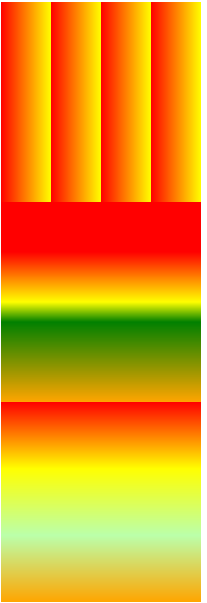
径向渐变 ※
<!DOCTYPE html><html lang="en"><head><meta charset="UTF-8"><meta name="viewport" content="width=device-width, initial-scale=1.0"><meta http-equiv="X-UA-Compatible" content="ie=edge"><title>径向渐变</title><style> .box1{ width: 300px; height: 300px; /*radial-gradient() 径向渐变(放射性的效果) */ /* 默认情况下径向渐变的形状根据元素的形状来计算的 正方形 --> 圆形 长方形 --> 椭圆形 - 我们也可以手动指定径向渐变的大小 circle ellipse - 也可以指定渐变的位置 - 语法: radial-gradient(大小 at 位置, 颜色 位置 ,颜色 位置 ,颜色 位置) 大小: circle 圆形 ellipse 椭圆 closest-side 近边 closest-corner 近角 farthest-side 远边 farthest-corner 远角 位置: top right left center bottom */ background-image: radial-gradient(farthest-corner at 100px 100px, red , #bfa) } </style></head><body><div class="box1"></div></body></html>
效果图: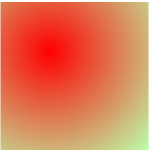


 Myth丶恋晨
 系统管理员
系统管理员 向右看齐
向右看齐 迈不过友情╰
 淩亂°似流年


![策略游戏设计日记[一]](https://image.dandelioncloud.cn/images/20230521/716f837882684a618ed4464805321291.png "策略游戏设计日记[一]")


还没有评论,来说两句吧...