Flutter 输入框 TextField、表单 Form 图文示例
文章目录
- 输入框 TextField
- 默认效果
- 监听内容变化,获取输入框的内容
- 和键盘的交互
- 美化 TextField 样式
- 表单 Form 验证
- 输入框内容校验
- 输入框内容重置
- 输入内容保存
- 登录页面例子
输入框 TextField
TextField用于文本输入,它提供了很多属性:
const TextField({Key key,this.controller,// 控制器this.focusNode, // 控制TextField是否占有当前键盘的输入焦点this.decoration = const InputDecoration(), // 控制TextField的外观显示TextInputType keyboardType,// 输入框默认的键盘输入类型this.textInputAction,this.textCapitalization = TextCapitalization.none,this.style,//输入文本的样式this.strutStyle,this.textAlign = TextAlign.start,//文本对齐方式this.textAlignVertical,this.textDirection,this.readOnly = false,ToolbarOptions toolbarOptions,this.showCursor,// 显示光标this.autofocus = false,//是否自动对焦this.obscureText = false,//是否隐藏输入的内容this.autocorrect = true,//是否自动更正this.enableSuggestions = true,this.maxLines = 1,// 最大行数this.minLines,//最小行数this.expands = false,this.maxLength,//最大长度this.maxLengthEnforced = true,this.onChanged,// 输入框变化回调this.onEditingComplete,// 编辑完成回调this.onSubmitted,// 提交回调this.inputFormatters,//允许的输入格式this.enabled,//是否禁用textfieldthis.cursorWidth = 2.0,// 光标宽度this.cursorRadius,//光标半径this.cursorColor,//光标颜色this.keyboardAppearance,this.scrollPadding = const EdgeInsets.all(20.0),this.dragStartBehavior = DragStartBehavior.start,this.enableInteractiveSelection = true,this.onTap,this.buildCounter,this.scrollController,this.scrollPhysics,})
字段太多了,我们从几个示例来了解主要字段的使用。
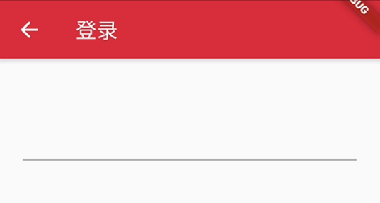
默认效果
只有一条下划线,也没有自动获取焦点。
TextField();
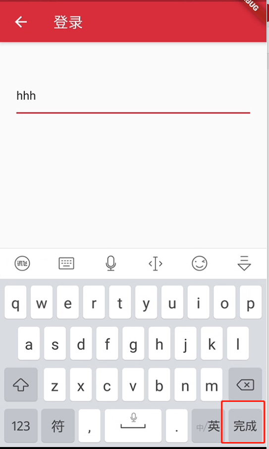
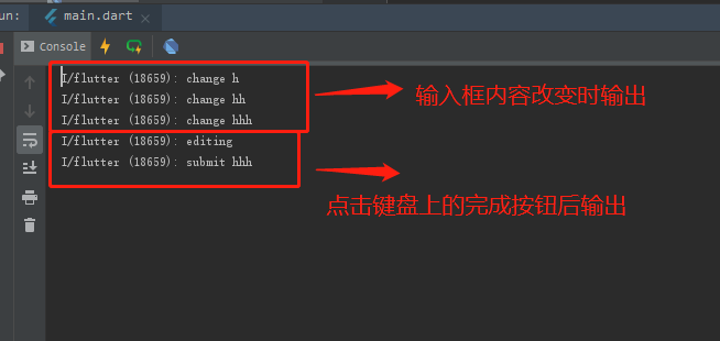
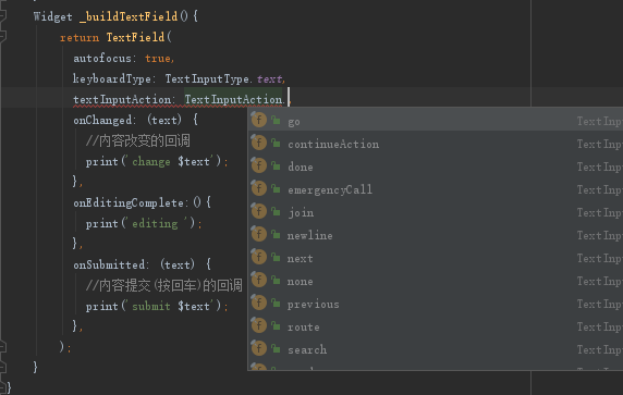
监听内容变化,获取输入框的内容
如果我们要获取输入的内容,这时候可以通过onChange, onSubmitted,伪代码如下:
Widget _buildTextField(){return TextField(onChanged: (text) {//内容改变的回调print('change $text');},onEditingComplete:(){print('editing ');},onSubmitted: (text) {//内容提交(按回车)的回调print('submit $text');},);}
和键盘的交互
默认获取焦点
只需要将autofocus设置为true即可。
Widget _buildTextField(){return TextField(autofocus: true,);}
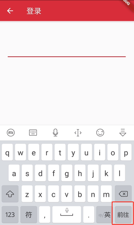
改变键盘右下角的功能键
Widget _buildTextField(){return TextField(autofocus: true,keyboardType: TextInputType.text,// 右下角按钮变为:前往或者GotextInputAction:TextInputAction.go,);}
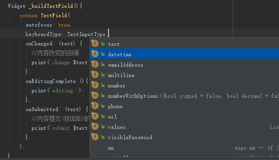
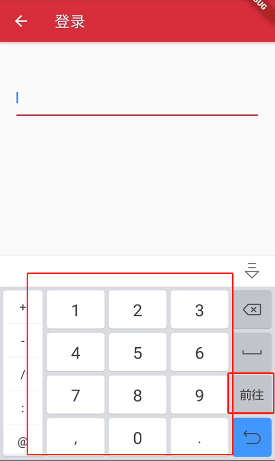
改变键盘的输入类型
Widget _buildTextField(){return TextField(autofocus: true,keyboardType: TextInputType.number,// 将键盘显示类型设置为数字键盘keyboardType: TextInputType.number,);}
如何自适应屏幕弹起
目前来看TextField已满足一个输入框的功能了。
但是它太丑了,这不符合Flutter构建一个漂亮App的目标
美化 TextField 样式
主要是使用TextField自带的字段修改,或者使用InputDecoration修改样式。TextField的常用字段我们在上面已经给出注释了,接下来查看InputDecoration的常见字段:
字段基本释义来源:Flutter文本输入框TextField属性(InputDecoration、textInputAction、inputFormatters等等)详解
const InputDecoration({this.icon, //位于装饰器外部和输入框前面的图片this.labelText,//用于描述输入框,当输入框获取焦点时默认会浮动到上方,this.labelStyle,// 控制labelText的样式this.helperText,//辅助文本,位于输入框下方,如果errorText不为空的话,则helperText不会显示this.helperStyle,//helperText的样式this.helperMaxLines,//提示信息最大行数this.hintText,//提示文本,位于输入框内部this.hintStyle,//hintText的样式this.hintMaxLines,//提示信息最大行数this.errorText,//errorText的信息this.errorStyle,//errorText的样式this.errorMaxLines, //errorText的最大行数this.hasFloatingPlaceholder = true, //labelText是否浮动,默认为truethis.isDense,//改变输入框是否为密集型this.contentPadding,//内间距this.prefixIcon,//位于输入框内部起始位置的图标。this.prefix,//预先填充的Widget,跟prefixText同时只能出现一个this.prefixText,//预填充的文本,例如手机号前面预先加上区号等this.prefixStyle,//prefixText的样式this.suffixIcon,//位于输入框后面的图片this.suffix, //位于输入框尾部的控件,同样的不能和suffixText同时使用this.suffixText,//位于尾部的填充文字this.suffixStyle, //suffixText的样式this.counter,//位于输入框右下方的小控件,不能和counterText同时使用this.counterText,//位于右下方显示的文本,常用于显示输入的字符数量this.counterStyle,//counterText的样式this.filled,//如果为true,则输入使用fillColor指定的颜色填充this.fillColor,//输入框的背景颜色this.focusColor,//输入框有焦点时的边框颜色this.hoverColor,//输入框被悬浮时的边框颜色this.errorBorder,//errorText不为空,输入框没有焦点时要显示的边框this.focusedBorder,//输入框有焦点时的边框this.focusedErrorBorder,//errorText不为空时,输入框有焦点时的边框this.disabledBorder,//输入框禁用时显示的边框this.enabledBorder,//输入框可用时显示的边框this.border,//正常情况下的borderthis.enabled = true,//输入框是否可用this.semanticCounterText,this.alignLabelWithHint,})
接下来我们通过几个例子来看看实现的效果图。
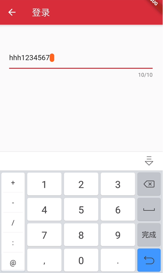
游标颜色、粗细,控制输入长度
Widget _buildTextField(){return TextField(autofocus: true,cursorColor: Colors.deepOrange,cursorRadius: Radius.circular(20.0),cursorWidth: 10.0,maxLength: 10,);}
密码框
增加obscureText: true,属性即可实现输入的内容是隐藏的。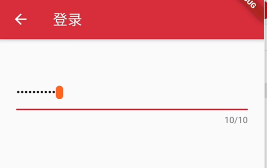
改变下划线颜色
默认下划线是跟随主题的红色,这里将其改为橘色700。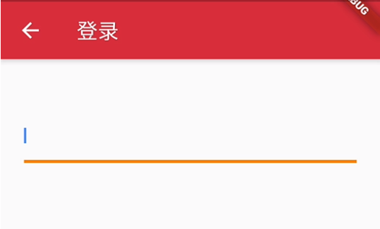
Widget _buildTextField(){return Container(child: TextField(autofocus: true,decoration: InputDecoration(border: InputBorder.none //隐藏下划线)),decoration: BoxDecoration(// 下滑线橘色700,宽度3像素border: Border(bottom: BorderSide(color: Colors.orange[700], width: 3.0))),);}
圆角输入框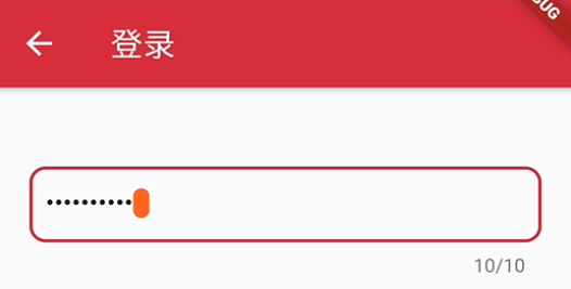
Widget _buildTextField(){return TextField(autofocus: true,cursorColor: Colors.deepOrange,cursorRadius: Radius.circular(20.0),cursorWidth: 10.0,maxLength: 10,obscureText: true,decoration: InputDecoration(// 文本内容的内边距contentPadding: EdgeInsets.all(10.0),// 圆角矩形的输入框样式border: OutlineInputBorder(// 圆角半径 10borderRadius: BorderRadius.circular(10.0),)),);}
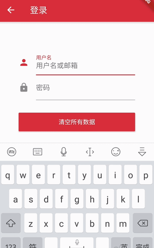
带有图标输入框
使用InputDecoration常见的一些属性完成了以下的效果图: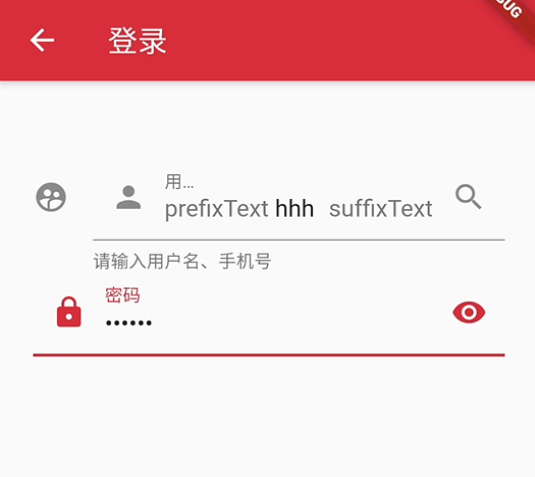
Widget _buildTextField(){return Column(children: <Widget>[TextField(decoration: InputDecoration(icon: Icon(Icons.supervised_user_circle),suffixIcon: Icon(Icons.search),prefixText: 'prefixText ',suffixText: 'suffixText',labelText: "用户名",helperText: '请输入用户名、手机号',hintText: "用户名或手机号",prefixIcon: Icon(Icons.person)),),TextField(decoration: InputDecoration(prefixIcon: Icon(Icons.lock),suffixIcon: Icon(Icons.remove_red_eye),labelText: "密码",hintText: "您的登录密码",hintStyle: TextStyle(color: Colors.grey, fontSize: 13.0)),obscureText: true,)],);}
表单 Form 验证
Flutter提供了一个Form 组件,它可以对输入框进行分组。Form对应的状态类为FormState,可以通过Form.of()或GlobalKey获得。获得状态类之后就可以做统一操作了如:
FormState.validate():调用此方法后,会调用子孙FormField的validate回调,如果有一个校验失败,则返回false,所有校验失败项都会返回用户返回的错误提示。FormState.save():调用此方法后,会调用子孙FormField的save回调,用于保存表单内容FormState.reset():调用此方法后,会将子孙FormField的内容清空。
输入框内容校验
- 自动校验
autovalidate: true, //开启自动校验,在 Form 组件下设置该属性为true
- 手动校验
通过点击按钮来校验Form中所有TextField的信息。
- 定义全局的
key,用于获取state - 在
TextField中做验证判断 - 点击按钮时获取
FormState,调用validate()方法。
由于代码过多,粘贴阅读体验不好,相关代码可参考:dongxi346/Flutter-WanAndroid
输入框内容重置
通过
FormState去调用var _formState = _formKey.currentState as FormState;
// Form 里面的所有TextField输入框内容都被清空
_formState.reset();
由于代码过多,粘贴阅读体验不好,相关代码可参考:dongxi346/Flutter-WanAndroid
输入内容保存
- 在
TextField中使用onSave字段
例如:
onSaved: (value){_passWord = value;},
通过
FormState去调用var _formState = _formKey.currentState as FormState;
// Form 里面的所有TextField onSave 方法都被调用
_formState.save();
由于代码过多,粘贴阅读体验不好,相关代码可参考:dongxi346/Flutter-WanAndroid
登录页面例子
原来的效果图来源忘记了,好像是在一个第三方库中出现的效果,当时觉得UI超级好看就直接复制了作者的源码在 现有的项目 Flutter-WanAndroid-login-page 中使用 ,如有侵权联系。
通过前面几篇文章以及本篇文章的分析,实现这个登录效果图应该是相当容易了。
这里暂不实现,待后面学习了布局的摆放后再来实现这个例子。


 朴灿烈づ我的快乐病毒、
 灰太狼
灰太狼 爱被打了一巴掌
 小鱼儿
小鱼儿 小灰灰
小灰灰 你的名字
你的名字")


还没有评论,来说两句吧...