css实现上中下布局(上下固定,中间自适应)
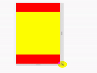
先上效果图:
实现方法:
方法一:
这个最简单,利用css中vh单位和calc() 函数
使用场景:
页面布局
<!DOCTYPE html><html lang="en"><head><meta charset="UTF-8"><meta http-equiv="X-UA-Compatible" content="IE=edge"><meta name="viewport" content="width=device-width, initial-scale=1.0"><title>css上中下布局</title><style> body { margin: 0; padding: 0; } .top { height: 100px; background: red; } .center { height: calc(100vh - 200px); background: yellow; } .bottom { height: 100px; background: red; } </style></head><body><div class="top"></div><div class="center"></div><div class="bottom"></div></body></html>
方法二
利用css定位属性
使用场景:
一般用于某些元素根据屏幕大小适配,这个弹窗上下部分固定,中间部分需要自适应高度时
<!DOCTYPE html><html lang="en"><head><meta charset="UTF-8"><meta http-equiv="X-UA-Compatible" content="IE=edge"><meta name="viewport" content="width=device-width, initial-scale=1.0"><title>css上中下布局</title><style> body { margin: 0; padding: 0; } .top { position: absolute; top: 0; width: 100%; height: 100px; background: red; } .center { position: absolute; top: 100px; bottom: 100px; width: 100%; height: auto; background: yellow; } .bottom { position: absolute; height: 100px; width: 100%; bottom: 0; background: red; } </style></head><body><div class="top"></div><div class="center"></div><div class="bottom"></div></body></html>
方法三
使用flex布局,这个时候父元素一定要给高度
使用场景:
同方法二
<!DOCTYPE html><html lang="en"><head><meta charset="UTF-8"><meta http-equiv="X-UA-Compatible" content="IE=edge"><meta name="viewport" content="width=device-width, initial-scale=1.0"><title>css上中下布局</title><style> body { margin: 0; padding: 0; display: flex; flex-direction: column; /* 父元素一定要给高度 */ height: 100vh; } .top { width: 100%; height: 100px; background: red; } .center { width: 100%; flex: 1; background: yellow; } .bottom { width: 100%; height: 100px; background: red; } </style></head><body><div class="top"></div><div class="center"></div><div class="bottom"></div></body></html>
应该还有很多实现的方法,目前我常用的就是这几种,有更好的方案的同学可以一起交流。
个人水平有限,有问题欢迎大家留言指导,仅供学习和参考。
学海无涯!努力二字,共勉!


 谁践踏了优雅
 向右看齐
向右看齐 深藏阁楼爱情的钟
 朱雀
朱雀 淩亂°似流年
 红太狼
红太狼


 多重继承(MI, multiple inheritance,主要研究多重公有继承)")


还没有评论,来说两句吧...