uni-app条件动态绑定样式
首先我们需要了解实现什么效果,
这里我想实现的效果
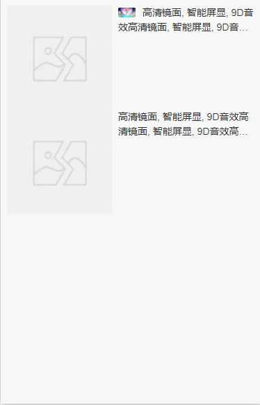
图片是否显示, 因为图片是绝对定位, 文本需要缩进行,这里动态绑定是否缩进行
直接看代码吧,不难
<template><view class="yh-list"><!--顶部搜索导航栏 S --><uni-nav-bar-classify class="yh-list-nav" background-color="#FFFFFF"><view class="nav-left" slot="left" @click="goBack"><image class="go-back" :src="iconGoBack" mode="widthFix"></image></view><view class="input-box-right"><input class="text-input" type="text" :value="hotSearchDefault || '请输入关键字'" /><image class="icon-search" src="@/static/icon/search.png" mode="widthFix"></image></view></uni-nav-bar-classify><!--顶部搜索导航栏 E --><!-- 写入内容 S --><view class="comment"><!-- 顶部导航 S --><view class="top-nav"><view class="menu"><block v-for="(item, index) in goodsMenuTop" , :key="index"><view class="menu-list"><view class="left">{{item.title}}</view><block v-if="index == 0"><image class="select-image" src="../../../static/icon/icon-select-close.png" mode="widthFix"></image></block><block v-if="index == 2"><image class="select-image" src="../../../static/icon/icon-select-close.png" mode="widthFix"></image></block></view></block><view class="layout-cut" @click="chooseLayoutCut"><image class="layout-cut-image" src="../../../static/icon/icon-list.png" mode="widthFix"></image></view></view><view class="goods-filtrate"><view class="shaixuan">筛选</view><image class="filtrate-image" src="../../../static/icon/icon-shaixuan.png" mode="widthFix"></image></view></view><!-- 顶部导航 E --><block v-if="layoutState != false"><!-- 四宫格布局 S --><view class="grid-layout">1</view><!-- 四宫格布局 E --></block><block v-else><!-- 列表布局 S --><view class="list-layout"><view class="goods" v-for="(item, index) in goodsList" :key><view class="goods-cover"><image class="cover-image" :src="item.goods_cover || errorImage" mode=""></image></view><view class="goods-info"><view class="goods-name"><block v-if="item.is_activity != 0"><image class="goods-activity" src="../../../static/banner/1.jpg" mode=""></image></block><text class="name" :class="{'text-indent': (item.is_activity != 0)}">{{item.goods_name}}</text></view></view></view></view><!-- 列表布局 E --></block></view><!-- 写入内容 E --></view></template><script>import uniNavBarClassify from '@/components/uni-nav-bar-classify/uni-nav-bar-classify.vue'export default {components: {uniNavBarClassify},data() {return {iconGoBack: this.$mAssetsPath.iconGoBack,errorImage: this.$mAssetsPath.errorImage,hotSearchDefault: '请输入关键字', // 搜索默认关键字goodsMenuTop: this.$mConstDataConfig.goodsMenuTop, // 商品列表导航菜单layoutState: false, // 显示布局状态默认falsegoodsList: [{goods_name: "高清镜面, 智能屏显, 9D音效高清镜面, 智能屏显, 9D音效高清镜面, 智能屏显, 9D音效",goods_cover: "",goods_price: 78.00,goods_comment_num: 1000,goods_good_reputation: 93,shop_name: "惠多多专营店",is_advertising: 0,is_activity: 1,is_autotrophy: 0,},{goods_name: "高清镜面, 智能屏显, 9D音效高清镜面, 智能屏显, 9D音效高清镜面, 智能屏显, 9D音效",goods_cover: "",goods_price: 78.00,goods_comment_num: 1000,goods_good_reputation: 93,shop_name: "惠多多专营店",is_advertising: 0,is_activity: 0,is_autotrophy: 0,}]}},methods: {// 返回上一级事件goBack() {uni.navigateBack({delta: 1})},// 布局切换chooseLayoutCut() {this.layoutState = !this.layoutState}}}</script><style lang="scss">.yh-list {width: 100%;background-color: #fff;display: flex;background-color: $color-white;/* #ifdef APP-PLUS */margin-top: calc(20upx + var(--status-bar-height));/* #endif */.yh-list-nav {position: fixed;z-index: 99;top: 0;.nav-left {width: 30px;padding-top: 6px;.go-back {width: 20px;}}.input-box-right {width: 100%;background-color: #f8f8f8;display: flex;align-items: center;height: 28px;border-radius: 40upx;padding: 0 20upx 0 30upx;.icon-search {width: 22px;}.text-input {width: 100%;font-size: 14px;color: #909399;}}},// 导航菜单.comment {width: 100%;background-color: #f8f8f8;// display: flex;height: 100%;position: absolute;padding-top: 88upx;/* #ifdef APP-PLUS */padding-top: calc(88upx + var(--status-bar-height));/* #endif */bottom: 0;.top-nav {width: 100%;height: 80upx;background-color: #FFFFFF;display: flex;align-items: center;font-size: $font-sm;box-shadow: 0 1upx 5upx #EEEEEE;.menu {width: 80%;display: flex;align-items: center;justify-content: space-between;.menu-list:nth-child(1),.menu-list:nth-child(3) {width: 180upx;height: 50upx;}.menu-list:nth-child(3) {justify-content: center;}.menu-list {display: flex;align-items: center;justify-content: center;.select-image {width: 35upx;}}.layout-cut {display: flex;align-items: center;margin-right: 28upx;}.layout-cut image {width: 40upx;}}.goods-filtrate {width: 20%;display: flex;align-items: center;justify-content: center;border-left: 1rpx solid #EEEEEE;height: 30upx;.shaixuan {}.filtrate-image {width: 30upx;margin-left: 5upx;}}}// 商品列表布局.list-layout {padding: 20rpx;.goods {display: flex;justify-content: space-between;.goods-cover {width: 300rpx;height: 300rpx;.cover-image {width: 100%;height: 100%;}}.goods-info {width: 392rpx;.goods-name {font-size: $font-base;.goods-activity {width: 50rpx;height: 28rpx;border-radius: 5rpx;margin-top: 6rpx;margin-right: 20rpx;vertical-align: middle;position: absolute;}.text-indent {text-indent: 70rpx}.name {text-overflow: -o-ellipsis-lastline;overflow: hidden;text-overflow: ellipsis;display: -webkit-box;-webkit-line-clamp: 2;line-clamp: 2;-webkit-box-orient: vertical;}}}}}}}</style>
判断样式主要代码 :class=”{‘text-indent’: (item.is_activity != 0)}“
有什么疑问可下方留言, 如有更好的解决办法,请下方留言,共同学习,谢谢大家支持


 迈不过友情╰
 ゞ 浴缸里的玫瑰
 「爱情、让人受尽委屈。」
 £神魔★判官ぃ


还没有评论,来说两句吧...