css实现简单的步骤条
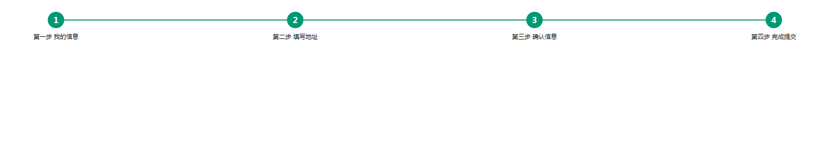
效果如图:
html部分:
<ul class="steps"><li>第一步 我的信息</li><li>第二步 填写地址</li><li>第三步 确认信息</li><li class="active">第四步 完成提交</li></ul>
css部分:
.steps {position: relative;margin-bottom: 30px;counter-reset: step; /*创建步骤数字计数器*/}/*步骤描述*/.steps li {list-style-type: none;font-size: 12px;text-align: center;width: 25%;position: relative;float: left;}/*步骤数字*/.steps li:before {display: block;content: counter(step); /*设定计数器内容*/counter-increment: step; /*计数器值递增*/width: 32px;height: 32px;background-color: #019875;line-height: 32px;border-radius: 32px;font-size: 16px;color: #fff;text-align: center;font-weight: 700;margin: 0 auto 8px auto;}/*连接线*/.steps li ~ li:after {content: '';width: 100%;height: 2px;background-color: #019875;position: absolute;left: -50%;top: 15px;z-index: -1; /*放置在数字后面*/}/*将当前/完成步骤之前的数字及连接线变绿*/.steps li.active:before,.steps li.active:after {background-color: #019875;}/*将当前/完成步骤之后的数字及连接线变灰*/.steps li.active ~ li:before,.steps li.active ~ li:after {background-color: #777;}


 阳光穿透心脏的1/2处
 朱雀
朱雀 系统管理员
系统管理员 ゞ 浴缸里的玫瑰
 小灰灰
小灰灰——DataGridView和ContextMenuStrip")

")


还没有评论,来说两句吧...