Android ProgressBar 详解 改变 ProgressBar 颜色
今天来说说 ProgressBar 这个东西,
之前一种是用的 项目里面 别人写好的直接用, 还没怎么细看这两个东西
ProgressBar 很简单就一进度条
默认情况下, 他是圆形的,
但是它还有另一种 水平长条状的形态
同时还需要了解的有:
- 水平形状的 ProgressBar 是有两个进度的 向我们看到 视频的精度条, 有一个是当前播放的,还有一个是下载的精度
- ProgressBar 分为确定和不确定的两种, android:indeterminate 为true 表示不确定
3.系统的关于 ProgressBar的Style有:
- style=”?android:attr/progressBarStyle”
- style=”?android:attr/progressBarStyleHorizontal”
- style=”?android:attr/progressBarStyleInverse”
- style=”?android:attr/progressBarStyleLarge”
- style=”?android:attr/progressBarStyleLargeInverse”
- style=”?android:attr/progressBarStyleSmall”
- style=”?android:attr/progressBarStyleSmallInverse”
- style=”?android:attr/progressBarStyleSmallTitle”
设置ProgressBar的样式有两种方式:
style=”@style/StyleProgressBarMini”
style=”?android:attr/progressBarStyleLargeInverse”
上面两种方式都可以设置PogressBar 的属性
我们在自定ProgressBar的时候一般用的都是第一种
下面看看 Android默认的两种 ProgressBar的Style
<style name="Widget.ProgressBar"><item name="indeterminateOnly">true</item><item name="indeterminateDrawable">@drawable/progress_medium_white</item><item name="indeterminateBehavior">repeat</item><item name="indeterminateDuration">3500</item><item name="minWidth">48dip</item><item name="maxWidth">48dip</item><item name="minHeight">48dip</item><item name="maxHeight">48dip</item><item name="mirrorForRtl">false</item></style>
上面是默认的 的Style 是圆形的而且是不确定
<style name="Widget.ProgressBar.Horizontal"><item name="indeterminateOnly">false</item><item name="progressDrawable">@drawable/progress_horizontal</item><item name="indeterminateDrawable">@drawable/progress_indeterminate_horizontal</item><item name="minHeight">20dip</item><item name="maxHeight">20dip</item><item name="mirrorForRtl">true</item></style>
这个是 水平的ProgressBar的 Style
progressDrawable 这个属性是 确定的进度条的属性
indeterminateDrawable 这个事不确定的 进度条的熟悉
我可以看看 系统默认的 @drawable/progress_horizontal
<layer-list xmlns:android="http://schemas.android.com/apk/res/android"><item android:id="@android:id/background"><shape><corners android:radius="5dip" /><gradientandroid:startColor="#ff9d9e9d"android:centerColor="#ff5a5d5a"android:centerY="0.75"android:endColor="#ff747674"android:angle="270"/></shape></item><item android:id="@android:id/secondaryProgress"><clip><shape><corners android:radius="5dip" /><gradientandroid:startColor="#80ffd300"android:centerColor="#80ffb600"android:centerY="0.75"android:endColor="#a0ffcb00"android:angle="270"/></shape></clip></item><item android:id="@android:id/progress"><clip><shape><corners android:radius="5dip" /><gradientandroid:startColor="#ffffd300"android:centerColor="#ffffb600"android:centerY="0.75"android:endColor="#ffffcb00"android:angle="270"/></shape></clip></item></layer-list>
上面有3个 item background、secondProgress、progress,看名字就能知道其大概作用, 我可以把这份文件copy 一份 就可以自己随心的改动 样式了
下面一份是自己定义的
<layer-list xmlns:android="http://schemas.android.com/apk/res/android" ><!-- background --><itemandroid:id="@android:id/background"android:drawable="@drawable/progress_patch_green"></item><!-- progress --><item android:id="@android:id/progress"><clip><nine-patch android:src="@drawable/progress_patch_galy" /></clip></item><!-- second progress --><item android:id="@android:id/secondaryProgress"><clip><nine-patch android:src="@drawable/progresspatch_blue" /></clip></item></layer-list>
需要注意的是 上面 .9 图的使用
关于 clip nine-patch 这些标签, 现在自己页不是很熟悉, 以后会写一篇关于这个的文章
如果不用Drawable的画, 只是想单纯的使用颜色该如何处理呢?
尝试过这样:
<layer-list xmlns:android="http://schemas.android.com/apk/res/android"><itemandroid:id="@android:id/background"android:drawable="@color/white"></item><itemandroid:id="@android:id/secondaryProgress"android:drawable="@color/red"></item><itemandroid:id="@android:id/progress"android:drawable="@color/red"></item></layer-list>
但是后面在设置 Progress的时候 不起作用, 看到的结果总是
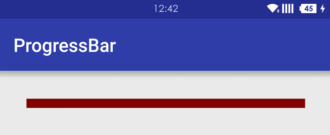
后面又尝试过 :
<layer-list xmlns:android="http://schemas.android.com/apk/res/android"><itemandroid:id="@android:id/background"><shape><solid android:color="@color/white"></solid></shape></item><itemandroid:id="@android:id/secondaryProgress"><shape><solid android:color="@color/red"></solid></shape></item><itemandroid:id="@android:id/progress"><shape><solid android:color="@color/red"></solid></shape></item></layer-list>
还是不行 和上面一样的
后面又尝试了这样的:
<layer-list xmlns:android="http://schemas.android.com/apk/res/android"><itemandroid:id="@android:id/background"><clip><shape><solid android:color="@color/white"></solid></shape></clip></item><itemandroid:id="@android:id/secondaryProgress"><clip><shape><solid android:color="@color/red"></solid></shape></clip></item><itemandroid:id="@android:id/progress"><clip><shape><solid android:color="@color/red"></solid></shape></clip></item></layer-list>
这下好了能够正常显示了: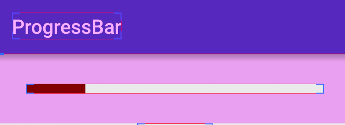
后面又尝试了这样的:
<layer-list xmlns:android="http://schemas.android.com/apk/res/android"><item android:id="@android:id/background"><clip><shape><gradientandroid:endColor="@color/white"android:startColor="@color/white"/></shape></clip></item><item android:id="@android:id/secondaryProgress"><clip><shape><gradientandroid:endColor="@color/colorPrimary"android:startColor="@color/colorPrimary"/></shape></clip></item><item android:id="@android:id/progress"><clip><shape><gradientandroid:endColor="@color/colorPrimary"android:startColor="@color/colorPrimary"/></shape></clip></item></layer-list>
也是ok 如图:
这是自己定义的ProgressBar的style
<style name="StyleProgressBarMini" parent="Widget.AppCompat.ProgressBar.Horizontal"><item name="android:maxHeight">50dp</item><item name="android:minHeight">10dp</item><item name="android:indeterminateOnly">false</item><item name="android:indeterminateDrawable">@android:drawable/progress_indeterminate_horizontal</item><item name="android:progressDrawable">@drawable/shape_progressbar_mini</item></style>
具体使用如下:
<ProgressBarandroid:id="@+id/pb_progressbar"style="@style/StyleProgressBarMini"android:layout_width="match_parent"android:layout_height="wrap_content"android:layout_margin="30dp"android:max="100"android:progress="50"/>
ok 下面说说 自定义圆形的
圆形的主要修改 android:indeterminateDrawable 属性
第一步,在drawable文件夹下新建:progressbar_circle_1.xml,如下:
<?xml version="1.0" encoding="utf-8"?><rotate xmlns:android="http://schemas.android.com/apk/res/android"android:drawable="@drawable/loading" //自定义的菊花图片android:fromDegrees="0"android:pivotX="50%"android:pivotY="50%"android:toDegrees="360" ></rotate>
第二步,在Style中定义mProgress_circle,如下:
<style name="mProgress_circle"><item name="android:indeterminateDrawable">@drawable/progressbar_circle_1</item><item name="android:minWidth">25dp</item><item name="android:minHeight">25dp</item><item name="android:maxWidth">60dp</item><item name="android:maxHeight">60dp</item></style>
支持大小自己随意定,别失真就好
第三步,组件中引用,如下
<ProgressBarandroid:id="@+id/progressBar2"style="@style/mProgress_circle"android:layout_gravity="center_vertical"android:layout_width="match_parent"android:indeterminateDuration="1200"android:layout_height="wrap_content" />
上面是通过一张图片填充 android:indeterminateDrawable ,我们也可以定义一个 动画 或者自定义 颜色(shape) 来实现,跟图片的用法一样:
定义动画 progress_circle_loading,xml:
<animation-list android:oneshot="false"xmlns:android="http://schemas.android.com/apk/res/android"><item android:duration="100" android:drawable="@drawable/loading_1" /><item android:duration="100" android:drawable="@drawable/loading_2" /><item android:duration="100" android:drawable="@drawable/loading_3" /><item android:duration="100" android:drawable="@drawable/loading_4" /><item android:duration="100" android:drawable="@drawable/loading_5" /><item android:duration="100" android:drawable="@drawable/loading_6" /></animation-list>
style的indeterminateDrawable引入:
<item name="android:indeterminateDrawable">@drawable/progress_circle_loading</item>
定义shape颜色 progress_circle_shape.xml
<rotate xmlns:android="http://schemas.android.com/apk/res/android"android:fromDegrees="0"android:pivotX="50%"android:pivotY="50%"android:toDegrees="360" ><shapeandroid:innerRadiusRatio="3"android:shape="ring"android:thicknessRatio="8"android:useLevel="false" ><gradientandroid:centerColor="#FFFFFF"android:centerY="0.50"android:endColor="#1E90FF"android:startColor="#000000"android:type="sweep"android:useLevel="false" /></shape></rotate>
style的indeterminateDrawable引入:
<item name="android:indeterminateDrawable">@drawable/progress_circle_shape</item>
关于seekBar 的自定义和ProgressBar的基本一致
ok 老实说, 上面的关于 gradient shape 这新的知识不是很熟悉, 以后要专门写一篇关于这个的
参考了以下文章
http://blog.csdn.net/mad1989/article/details/38042875


 女爷i
女爷i 超、凢脫俗
超、凢脫俗 红太狼
红太狼 亦凉
亦凉 不念不忘少年蓝@
")


还没有评论,来说两句吧...