CSS自适应布局
什么是布局,其实就是用定位和尺寸相关的属性来完成布局,布局会用到的有:普通流、浮动、绝对定位三种定位机制,CSS3中的transform、flex等
先来说float浮动,现在比较多的网站都在用这种
浮动布局:
我们都知道float让元素脱离了普通流,然后使用width/height,margin/padding将元素定位,从别处盗了图,索然盗图可耻
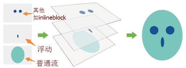
看是不是浮动已经脱离了普通流了?
好了,现在步入正题:
第一种情况:
左边和右边都固定,
<!DOCTYPE html><html><head><meta charset="utf-8" /><title>宽度自适应布局</title><style>.wrap {background-color:green;}.clearfix:after {content: "";clear: both;display: block;}.left {float: left;width: 100px;background:blue;height: 180px;}.right {float: right;width: 160px;background:red;height: 200px;}.center {background: grey;margin-left: 100px;margin-right: 160px;height: 150px;}</style></head><body><div class="wrap clearfix"><div class="left">left,宽度是固定的哈哈哈哈。</div><div class="right">right,宽度是固定的哈哈哈。</div><div class="center">center,自适应哦。</div></div></body></html>
结果如图:

上述写法有个问题就是如果网络不好用,而我现在想中间的东西先渲染,那该怎么写呢:
<!DOCTYPE html><html><head><meta charset="utf-8" /><title>宽度自适应布局</title><style>.wrap {background-color: red;margin-left: 100px;margin-right: 150px;}.clearfix:after {content: "";clear: both;display: block;}.left {float: left;width: 100px;background: grey;height: 180px;margin-left: calc(-100% - 100px); //css3用法-100%就是整个center,}.right {float: right;width: 150px;background: blue;height: 200px;margin-right: -150px;}.center {background: greens;height: 150px;float: left;width: 100%;}</style></head><body><div class="wrap clearfix"><div class="center">center,自适应浏览器宽度。</div><div class="left">left,宽度固定</div><div class="right">right,宽度固定</div></div></body></html>
其实除了这个float我们还可以用其他的方法:
<!DOCTYPE html><html><head><meta charset="utf-8" /><title>宽度自适应布局</title><style>.center{margin:0 200px; overflow: hidden; background:red;}.left{position:absolute; top:0; left: 0;width:200px;background: #ff0;}.right{ position: absolute;top:0; right:0; width:200px; background: #0ff;}</style></head><body><div class="wrap clearfix"><div class="left">left,宽度是固定的哈哈哈哈。</div><div class="right">right,宽度是固定的哈哈哈。</div><div class="center">center,自适应哦。</div></div></body></html>
或者:
<!DOCTYPE html><html><head><meta charset="utf-8" /><title>宽度自适应布局</title><style>.center{ position: absolute; top:0; left:200px; right:200px;background: #ccc;}.left{ float:left;width:200px;background: #ff0;}.right{ float:right;width:200px; background: #0ff;}</style></head><body><div class="wrap clearfix"><div class="left">left,宽度是固定的哈哈哈哈。</div><div class="right">right,宽度是固定的哈哈哈。</div><div class="center">center,自适应哦。</div></div></body></html>
其中有些是参考别人的,先写到这里吧


 心已赠人
心已赠人 朱雀
朱雀 小灰灰
小灰灰


还没有评论,来说两句吧...