让web页面页脚footer固定在页面底部
有时候,我们发现很多页面内容不多的时候,页面底部内容飘到了中间:
这个页面底部没有固定,结果…,一个前端工程师是无法接受这样的结果的。
这里介绍一种通用的解决办法,让页面底部固定。
思路: 首先需要一个容器包裹所有的页面元素,这里使用
来做。id为container的容器需要设置高度100%,否则,当内容较少的时候,还是会飘起来。最后,主要的是footer底部元素需要绝对定位,让他固定在底部。下面直接上代码:
content.html
<!DOCTYPE html><html lang="en"><head><meta charset="UTF-8"><title>layout</title><link rel="stylesheet" type="text/css" href="css/base.css"><link rel="stylesheet" type="text/css" href="css/public.css"></head><body><div id="container"><header class="clearfix"><div class="user-info fr"><a class="user-name" href="" title="用户名">admin</a><a class="logout" href="">退出</a></div><div class="logo fl">xxx管理系统</div></header><main class="content"><aside class="grid-left">菜单</aside><section class="grid-right"><p>内容变多了</p><p>内容变多了</p><p>内容变多了</p><p>内容变多了</p><p>内容变多了</p><p>内容变多了</p><p>内容变多了</p><div style="height:300px;background:lightgreen;"></div><p>内容变多了</p><p>内容变多了</p><p>内容变多了</p><p>内容变多了</p><p>内容变多了</p><p>内容变多了</p><p>内容变多了</p><p>内容变多了</p><p>内容变多了</p><p>内容变多了</p><p>内容变多了</p><p>内容变多了</p><p>内容变多了</p><p>内容变多了</p></section></main><footer class="footer"><div class="sub-foot"><ul><li><a>法律条款</a></li><li><a>隐私保护</a></li><li><a>联系我们</a></li><li><a>常见问题</a></li></ul><p>版权所有@1998-2018xx集团</p></div></footer></div></body><script type="text/javascript">window.onload = function(){var height = document.body.offsetHeight;var ele = document.querySelector(".content");ele.style.height = (height-140)+"px";}</script></html>
base.css
*{margin:0;padding:0;}html,body,div,input,h1,h2,h3,h4,h5,h6,p{font-size:100%;font-weight: normal;font-family: Helvetica;}.clearfix{*zoom:1;}.clearfix:after{display:table;content:'';clear: both;line-height:0;}.fr{float:right;}.fl{float:left;}a{color:#0088cc;text-decoration: none;}
public.css
html,body{width:100%;height:100%;}#container{min-height: 100%;position: relative;height:auto !important;}header{height:59px;border-bottom: 1px solid #ddd;background: #f7f7f7;}header .logo{cursor: pointer;height: 59px;line-height: 59px;margin-left: 20px;}.user-info{margin-right: 20px;}.user-info a{text-decoration: none;color:#000;}.user-info .user-name{height:59px;line-height: 50px;}.content{display:flex;}.grid-left{flex:none;float:left;border-right:1px solid #ddd;width:160px;}.grid-right{flex:1;float:right;overflow-x:hidden;overflow-y: auto;}footer{position: absolute;bottom:0px;height:79px;border-top:1px solid #ddd;width:100%;background: #f7f7f7;}.sub-foot{width:1000px;margin:0 auto;text-align: center;}.sub-foot ul{}.sub-foot li{display:inline-block;height:30px;line-height:30px;}.sub-foot p{height:30px;line-height: 30px;}
最终的结果:
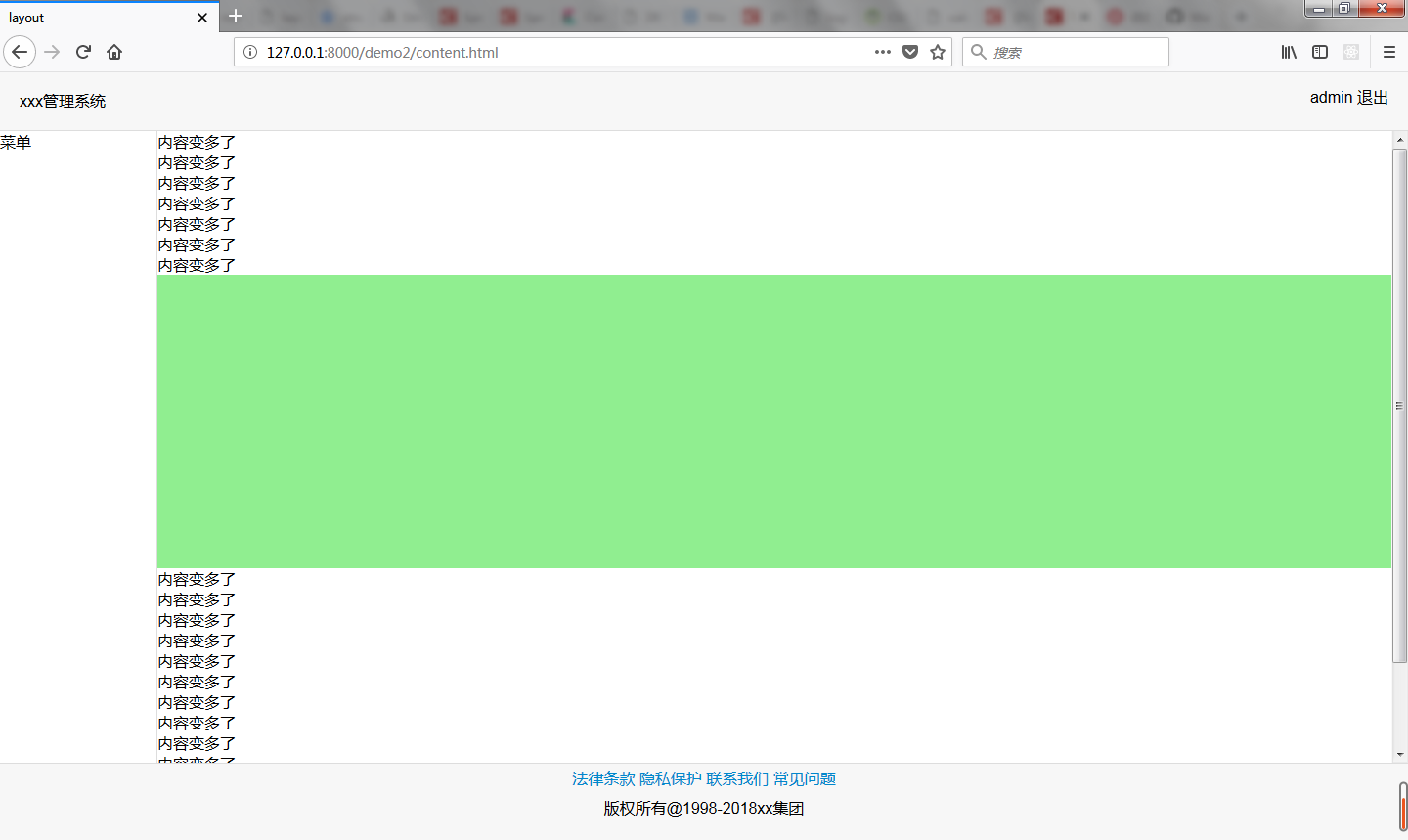
这里的关键地方:html,body均需要设置高度为100%,另外,id=container 的元素需要设置min-height:100%,这样页面就会被撑起来。而不是随着内容高度自适应。当页面内容过多之后,让多出容器的部分滚动,这样,页脚相当于就固定在了底部。


 电玩女神
电玩女神 刺骨的言语ヽ痛彻心扉
 红太狼
红太狼 野性酷女
野性酷女


还没有评论,来说两句吧...