自定义初学4——自定义属性
前面只是简单说了自定义View,接下来我们再来个增强版——自定义View的属性
1、自定义View的属性,首先在res/values/ 下建立一个attrs.xml , 在里面定义我们的属性。
这里简单介绍一下控件的常用属性
format的取值及使用
- Reference:引用类型,参考某一资源ID
(1)属性定义:
<declare-styleable name = "名称"><attr name = "background" format = "reference"/><attr name = "src" format = "reference" /></declare-styleable>
(2)属性使用:
<ImageView android:layout_width = "42dip"android:layout_height = "42dip"android:background = "@drawable/图片ID"/>
- color:颜色值。
(1)属性定义:
<declare-styleable name = "名称"><attr name = "textColor" format = "color"/></declare-styleable>
(2)属性使用:
<TextView android:layout_width = "42dip"android:layout_height = "42dip"android:textColor = "#00FF00"/>
- boolean:布尔值。
(1)属性定义:
<declare-styleable name = "名称"><attr name = "focusable" format = "boolean"/></declare-styleable>
(2)属性使用:
<Button android:layout_width = "42dip"android:layout_height = "42dip"android:focusable = "true"/>
- dimension:尺寸值。
(1)属性定义:
<declare-styleable name = "名称"><attr name = "layout_width" format = "dimension"/><attr name = "layout_height" format = "dimension"/></declare-styleable>
(2)属性使用:
<Button android:layout_width = "42dip"android:layout_height = "42dip"/>
- float:浮点值。
(1)属性定义:
<declare-styleable name = "名称"><attr name = "fromAlpha" format = "float"/><attr name = "toAlpha" format = "float"/></declare-styleable>
(2)属性使用:
<alpha android:fromAlpha = "1.0" android:toAlpha = "0.7"/>
- integer:整型值。
(1)属性定义:
<declare-styleable name = "名称"><attr name = "visible"/><attr name = "frameDuration" format="integer"/><attr name = "framesCount" format="integer"/><attr name = "pivotX"/><attr name = "pivotY"/><attr name = "drawable"/></declare-styleable>
(2)属性使用:
<animated-rotate xmlns:android ="http://schemas.android.com/apk/res/android"android:drawable = "@drawable/图片ID"android:pivotX = "50%"android:pivotY = "50%"android:framesCount = "12"android:frameDuration = "100"/>
- string:字符串。
(1)属性定义:
<declare-styleable name = "名称"><attr name = "text" format = "string" /></declare-styleable>
(2)属性使用:
<TextViewandroid:layout_width = "fill_parent"android:layout_height = "fill_parent"android:text ="0jOkQ80oD1JL9C6HAja99uGXCRiS2CGjKO_bc_g"/>
- fraction:百分数类型。
(1)属性定义:
<declare-styleable name="名称"><attr name = "visible"/><attr name = "fromDegrees" format = "float"/><attr name = "toDegrees" format = "float"/><attr name = "pivotX" format = "fraction"/><attr name = "pivotY" format = "fraction"/><attr name = "drawable"/></declare-styleable>
(2)属性使用:
<rotate xmlns:android ="http://schemas.android.com/apk/res/android"android:interpolator = "@anim/动画ID"android:fromDegrees = "0"android:toDegrees = "360"android:pivotX = "200%"android:pivotY = "300%"android:duration = "5000"android:repeatMode = "restart"android:repeatCount = "infinite"/>
- enum:枚举值。
(1)属性定义:
<declare-styleable name="名称"><attr name="orientation"><enum name="horizontal" value="0"/><enum name="vertical" value="1"/></attr></declare-styleable>
(2)属性使用:
<LinearLayout xmlns:android = "http://schemas.android.com/apk/res/android"android:orientation = "vertical"android:layout_width = "fill_parent"android:layout_height = "fill_parent"></LinearLayout>
- flag:位或运算。
(1)属性定义:
<declare-styleable name="名称"><attr name="windowSoftInputMode"><flag name = "stateUnspecified" value = "0"/><flag name = "stateUnchanged" value = "1"/><flag name = "stateHidden" value = "2"/><flag name = "stateAlwaysHidden" value = "3"/><flag name = "stateVisible" value = "4"/><flag name = "stateAlwaysVisible" value = "5"/><flag name = "adjustUnspecified" value = "0x00"/><flag name = "adjustResize" value = "0x10"/><flag name = "adjustPan" value = "0x20"/><flag name = "adjustNothing" value = "0x30"/></attr></declare-styleable>
(2)属性使用:
<activity android:name = ".StyleAndThemeActivity"android:label = "@string/app_name"android:windowSoftInputMode = "stateUnspecified | stateUnchanged | stateHidden"><intent-filter><action android:name = "android.intent.action.MAIN"/><category android:name = "android.intent.category.LAUNCHER"/></intent-filter></activity>
注意:
属性定义时可以指定多种类型值。
(1)属性定义:
<declare-styleable name = "名称"><attr name = "background" format = "reference|color"/></declare-styleable>
(2)属性使用:
<ImageView android:layout_width = "42dip"android:layout_height = "42dip"android:background = "@drawable/图片ID|#00FF00"/>
- 多类型
2、在布局文件中声明我们的View
<com.example.activity.view.CustomAttrViewandroid:layout\_width="wrap\_content"android:layout\_height="wrap\_content"android:layout\_centerInParent="true"android:padding="10dp"custom:text="9958"custom:textColor="\#ff0000"custom:textSize="30sp" />
这里要强调的一点就是,一定要引入我们自己的名称空间(我绿色标注的部分),后面的包路径指的是项目的包名。
3、在View的构造方法中,获得我们的自定义的属性
public class CustomAttrView extends View {
private String mStrText;private int mTextColor;private int mTextSize;/\*\*\* 绘制时控制文本绘制的范围\*/private Rect mBound;private Paint mPaint;public CustomAttrView(Context context) \{this(context, null);\}public CustomAttrView(Context context, AttributeSet attrs) \{this(context, attrs, 0);\}// 获得自定义的样式属性public CustomAttrView(Context context, AttributeSet attrs, int defStyle) \{super(context, attrs, defStyle);/\*\*\* 获得自定义样式属性\*/TypedArray typedArray = context.getTheme().obtainStyledAttributes(attrs,R.styleable.CustomAttrView, defStyle, 0);
// int n = typedArray.getIndexCount();
// for (int i = 0; i < n; i++) {
// int attr = typedArray.getIndex(i);
// switch (attr) {
// case R.styleable.CustomAttrView_text:
// mStrText = typedArray.getString(attr);
// break;
// case R.styleable.CustomAttrView_textColor:
// // 默认颜色设置为黑色
// mTextColor = typedArray.getColor(attr, Color.BLACK);
// break;
// case R.styleable.CustomAttrView_textSize:
// // 默认设置为16sp,TypeValue也可以把sp转化为px
// mTextSize = typedArray.getDimensionPixelSize(attr,
// (int) TypedValue.applyDimension(
// TypedValue.COMPLEX_UNIT_SP, 16, getResources()
// .getDisplayMetrics()));
// break;
//
// }
//
// }
/\*\*\* 下面三句和上面注释掉的句子的作用一样\*/mStrText = typedArray.getString(R.styleable.CustomAttrView\_text);mTextColor = typedArray.getColor(R.styleable.CustomAttrView\_textColor, Color.BLACK);mTextSize = typedArray.getDimensionPixelSize(R.styleable.CustomAttrView\_textSize,16);typedArray.recycle();mPaint = new Paint();mPaint.setTextSize(mTextSize);mPaint.setColor(mTextColor);
/**
\* 获得绘制文本的宽和高\*/mBound = new Rect();mPaint.getTextBounds(mStrText, 0, mStrText.length(), mBound);\}
}
4、重写onDraw,调用系统提供的onMesure方法
@Override
protected void onMeasure(int widthMeasureSpec, int heightMeasureSpec) \{super.onMeasure(widthMeasureSpec, heightMeasureSpec);
}
@Override
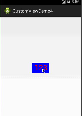
protected void onDraw(Canvas canvas) \{mPaint.setColor(Color.BLUE);canvas.drawRect(0, 0, getMeasuredWidth(), getMeasuredHeight(), mPaint);mPaint.setColor(mTextColor);canvas.drawText(mStrText, getWidth() / 2 - mBound.width() / 2,getHeight() / 2 + mBound.height() / 2, mPaint);\}
此时效果如下:
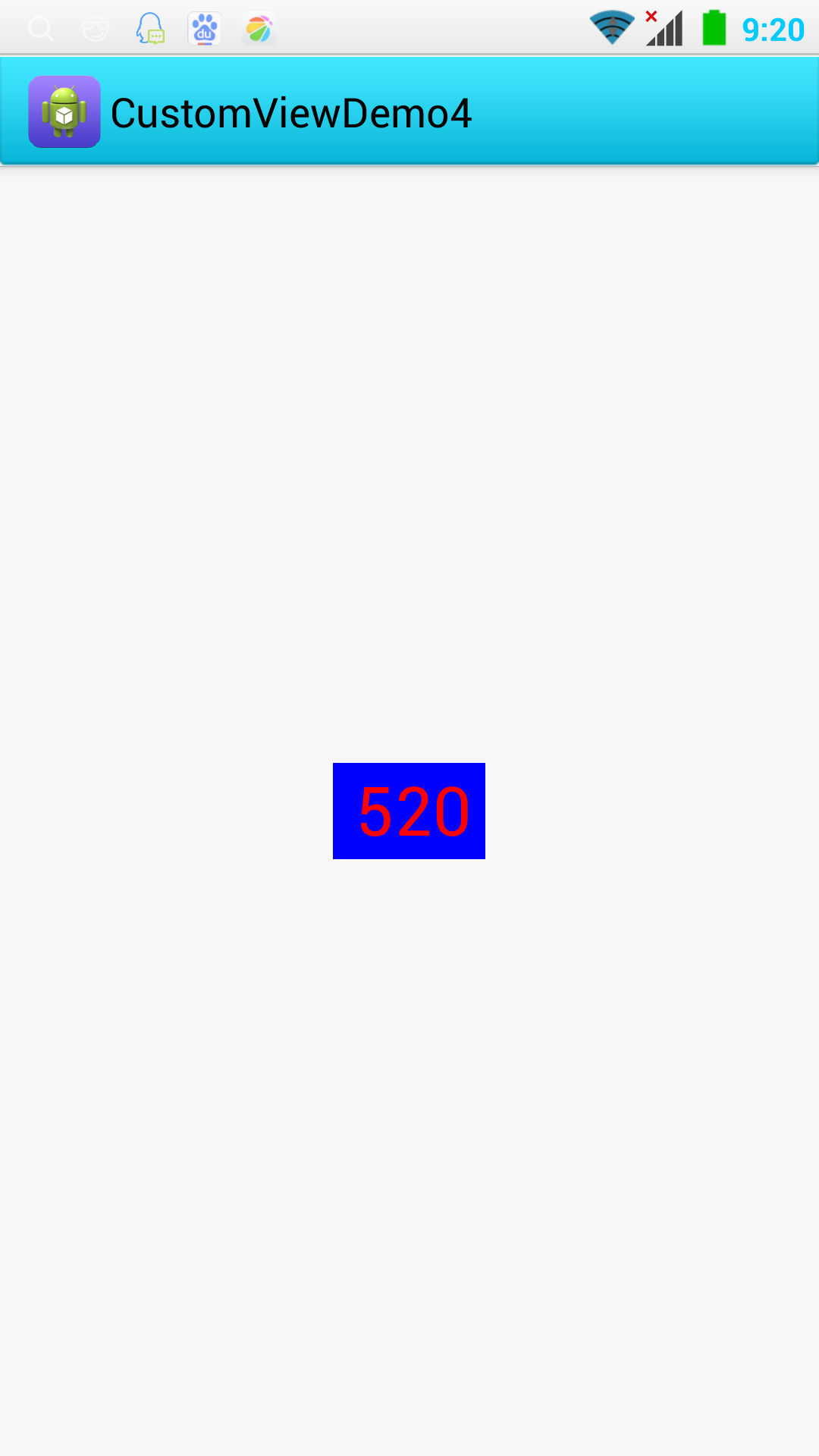
但是此时如果我们把布局文件的宽和高写成wrap_content,会发现效果和我们想的并不一样:
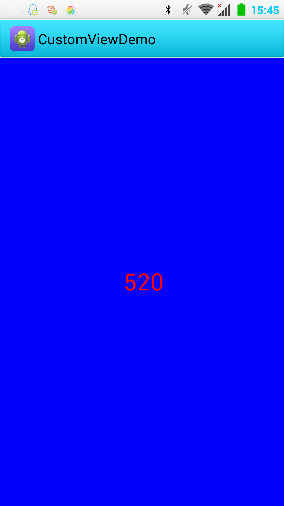
这是因为系统帮我们测量的高度和宽度都是MATCH_PARNET,当我们设置明确的宽度和高度时,系统帮我们测量的结果就是我们设置的结果,当我们设置为WRAP_CONTENT或者MATCH_PARENT系统帮我们测量的结果就是MATCH_PARENT的长度。
所以,当设置了WRAP_CONTENT时,我们需要自己进行测量,即重写onMesure方法,重写之前先了解下MeasureSpec的specMode的类型:
EXACTLY:一般是设置了明确的值或者是MATCH_PARENT
AT_MOST:表示子布局限制在一个最大值内,一般为WARP_CONTENT
UNSPECIFIED:表示子布局想要多大就多大,很少使用
下面是我们重写onMeasure代码:
@Override
protected void onMeasure(int widthMeasureSpec, int heightMeasureSpec) \{super.onMeasure(widthMeasureSpec, heightMeasureSpec);int width = 0;int height = 0;/\*\*\* 设置宽度\*/int specMode = MeasureSpec.getMode(widthMeasureSpec);int specSize = MeasureSpec.getSize(widthMeasureSpec);switch (specMode) \{case MeasureSpec.EXACTLY:// 明确指定了width = getPaddingLeft() + getPaddingRight() + specSize;break;case MeasureSpec.AT\_MOST:// 一般为WARP\_CONTENTwidth = getPaddingLeft() + getPaddingRight() + mBound.width();break;\}/\*\*\* 设置高度\*/specMode = MeasureSpec.getMode(heightMeasureSpec);specSize = MeasureSpec.getSize(heightMeasureSpec);switch (specMode) \{case MeasureSpec.EXACTLY:// 明确指定了height = getPaddingTop() + getPaddingBottom() + specSize;break;case MeasureSpec.AT\_MOST:// 一般为WARP\_CONTENTheight = getPaddingTop() + getPaddingBottom() + mBound.height();break;\}setMeasuredDimension(width, height);\}
现在我们可以对高度、宽度进行随便的设置了,基本可以满足我们的需求。
当然了我们这个自定义View与TextView相比还没什么区别,但是前面的例子已经提到,我们可以给View添加一些监听事件,代码就不写了,想看的话可以下载源码。
源代码
参考:
http://blog.csdn.net/lmj623565791/article/details/24252901
http://www.jb51.net/article/32172.htm
http://blog.csdn.net/u013045971/article/details/42299533
http://blog.csdn.net/aigestudio/article/details/41212583


 ゝ一纸荒年。
 不念不忘少年蓝@
 小灰灰
小灰灰


还没有评论,来说两句吧...