ElementUI按钮组件
按钮组件(示例)
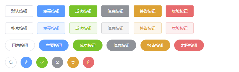
1.默认样式按钮<el-row><el-button>默认按钮</el-button><el-button type="primary">主要按钮</el-button><el-button type="success">成功按钮</el-button><el-button type="info">信息按钮</el-button><el-button type="warning">警告按钮</el-button><el-button type="danger">危险按钮</el-button></el-row>2.简洁按钮 plain 鼠标移动上去才会显示背景颜色<el-row><el-button plain>朴素按钮</el-button><el-button type="primary" plain>主要按钮</el-button><el-button type="success" plain>成功按钮</el-button><el-button type="info" plain>信息按钮</el-button><el-button type="warning" plain>警告按钮</el-button><el-button type="danger" plain>危险按钮</el-button></el-row>3.使用圆角按钮 round<el-row><el-button round>圆角按钮</el-button><el-button type="primary" round>主要按钮</el-button><el-button type="success" round>成功按钮</el-button><el-button type="info" round>信息按钮</el-button><el-button type="warning" round>警告按钮</el-button><el-button type="danger" round>危险按钮</el-button></el-row>4.图标按钮 idco:具体要显示的图标<el-row><el-button icon="el-icon-search" circle></el-button><el-button type="primary" icon="el-icon-edit" circle></el-button><el-button type="success" icon="el-icon-check" circle></el-button><el-button type="info" icon="el-icon-message" circle></el-button><el-button type="warning" icon="el-icon-star-off" circle></el-button><el-button type="danger" icon="el-icon-delete" circle></el-button></el-row>
按钮组件的详细使用
日后使用element ui的相关组件时需要注意的是 所有组件都是el-组件名称开头
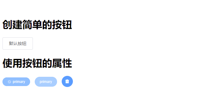
创建按钮:<el-button>默认按钮</el-button>
#
#
组件属性使用
总结:在element中所有的组件的属性使用都是直接将属性名=属性值方式写在对应的组件标签上,boolean类型的属性默认为false可以简写一个属性名字表示为true。

示例
<div><h1>创建简单的按钮</h1><el-button>默认按钮</el-button><h1>使用按钮的属性</h1><el-button type="primary" size="mini" round="true" loading>primary</el-button><el-button type="primary" size="small" round="true" disabled>primary</el-button><el-button type="primary" size="medium" circle icon="el-icon-delete-solid"></el-button></div>
按钮组的使用
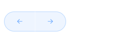
按钮组的使用就是通过<el-button-group>把多个按钮包裹起来
<el-button-group><el-button type="primary" plain round icon="el-icon-back"></el-button><el-button type="primary" plain round icon="el-icon-right"></el-button></el-button-group>


 逃离我推掉我的手
 Myth丶恋晨
 左手的ㄟ右手


")


还没有评论,来说两句吧...